5 Tips for Pattern Mixing in a Room
Do you love rooms that just seem cohesive and settled even though they are full of patterns?
Here are 5 strong, practical rules for mixing patterns in a room so that it feels layered and intentional rather than chaotic or overly matched.
1. Start with a Hero Pattern
Choose one dominant print to lead the room.
This is typically:
Wallpaper
Drapery
Bedding
Large upholstery piece (headboard, sofa, accent chair)
The hero pattern should establish the mood, scale, and colour direction of the space.
For example:
Large floral chintz → romantic English cottage
Structured stripe → tailored heritage
Organic botanical → relaxed European estate
Everything else should support—not compete with—the hero.
2. Vary the Scale (Large / Medium / Small)
One of the biggest mistakes is using patterns that are all the same visual weight.
A reliable formula:
60% Large Scale → statement pattern
30% Medium Scale → supporting print
10% Small Scale or Texture → subtle grounding
Think in contrast:
Large
Oversized florals
Scenic prints
Bold botanicals
Medium
Vine motifs
Damasks
Lattice or trellis
Small
Tiny ditsy florals
Pinstripes
Dots
Small geometrics
Example:
Large cabbage roses + medium ticking stripe + tiny scattered bud print = cohesive, layered, collected.
3. Mix Pattern Types, Not Just Different Prints
Rooms feel richer when pattern families contrast.
Try combining:
Organic: florals, botanicals, vines
Structured: stripes, plaids, checks
Textural/Quiet: woven look, subtle geometric, tone-on-tone
A useful formula:
1 floral + 1 stripe/check + 1 subtle texture
Example for English cottage:
Romantic floral wallpaper
Mattress ticking stripe bedding
Small woven diamond on a bench cushion
This prevents the room from feeling “too floral” or visually flat.
4. Repeat Colours (But Not Perfectly)
Patterns do not need identical colours—but they should speak to one another.
Aim for:
2–4 repeated colours across the room
Different saturation or proportions
Example:
If the wallpaper has dusty rose, sage, cream, and ochre:
Bedding may emphasize cream + sage
Chair fabric picks up dusty rose
Lampshade introduces muted ochre
This feels collected rather than “bought as a set.”
A useful rule:
Shared palette, different emphasis.
5. Give the Eye Places to Rest
Pattern mixing works best when balanced with solids and texture.
Use:
Painted walls or trim
Linen bedding
Natural wood
Rattan
Velvet
Wool
Simple lampshades
Negative space is what makes layered rooms feel sophisticated instead of busy.
A Simple Formula You Can Almost Always Trust
For a cohesive room:
1 hero floral
1 stripe or check
1 supporting organic print
1 subtle blender/texture
This is one reason many classic interiors feel so effortless—they are intentionally varied, not perfectly matched. The room feels collected over time rather than coordinated in a showroom sense.
New Collection: Strong & Sweet
I have been busy. Making patterns. And collections.
And it makes my heart sing…
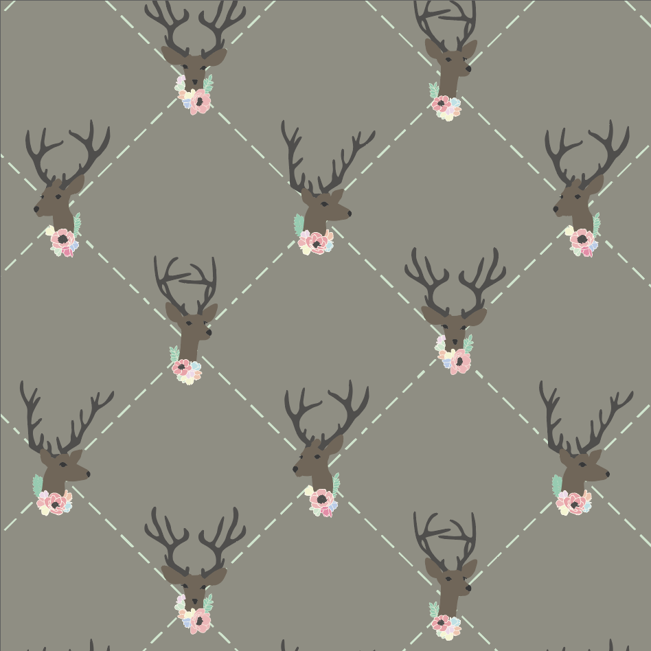
This is the second collection that I have designed. It was created around an outdoor/hunting theme and inspired by my youngest daughter. She is my tomboy, my outdoors girlie and so very independent. There is a strong, tough side to her, but at the same time she is so soft and sweet. All of the designs for this collection were made with her in mind.
Strong & Sweet Collection by rePapered
After designing this collection I realized that it would make a sweet theme for baby products. Can you imagine a onesie covered in flower camo? Or a swaddling blanket in the mountain landscape? Perhaps a diaper bag lining with the X and Os? And the mix of deer, arrows and flowers on a nursery wall would sure cozy up the room, don’t you think?
I would love your feedback on this collection.
Which prints are your fave?
First Pattern Collection
So…I made my first pattern collection!
While taking the Immersion course with Bonnie Christine, I was creating the motifs for a collection. By the end of the course I was able to put all of my newly acquired skills together to complete an entire pattern collection. This is a big deal for me!
During the past year I have been creating my own patterns using my original watercolour motifs and then trying to put them together using my skills in Photoshop. But Photoshop does not hold a candle to Illustrator when it comes to creating a pattern. So it was high time to learn Adobe Illustrator and that is what I did.
I named my collection Leaping Forward as we were on the verge of spring as I took the Immersion course and it was a nod to my decision to leap into a new adventure.
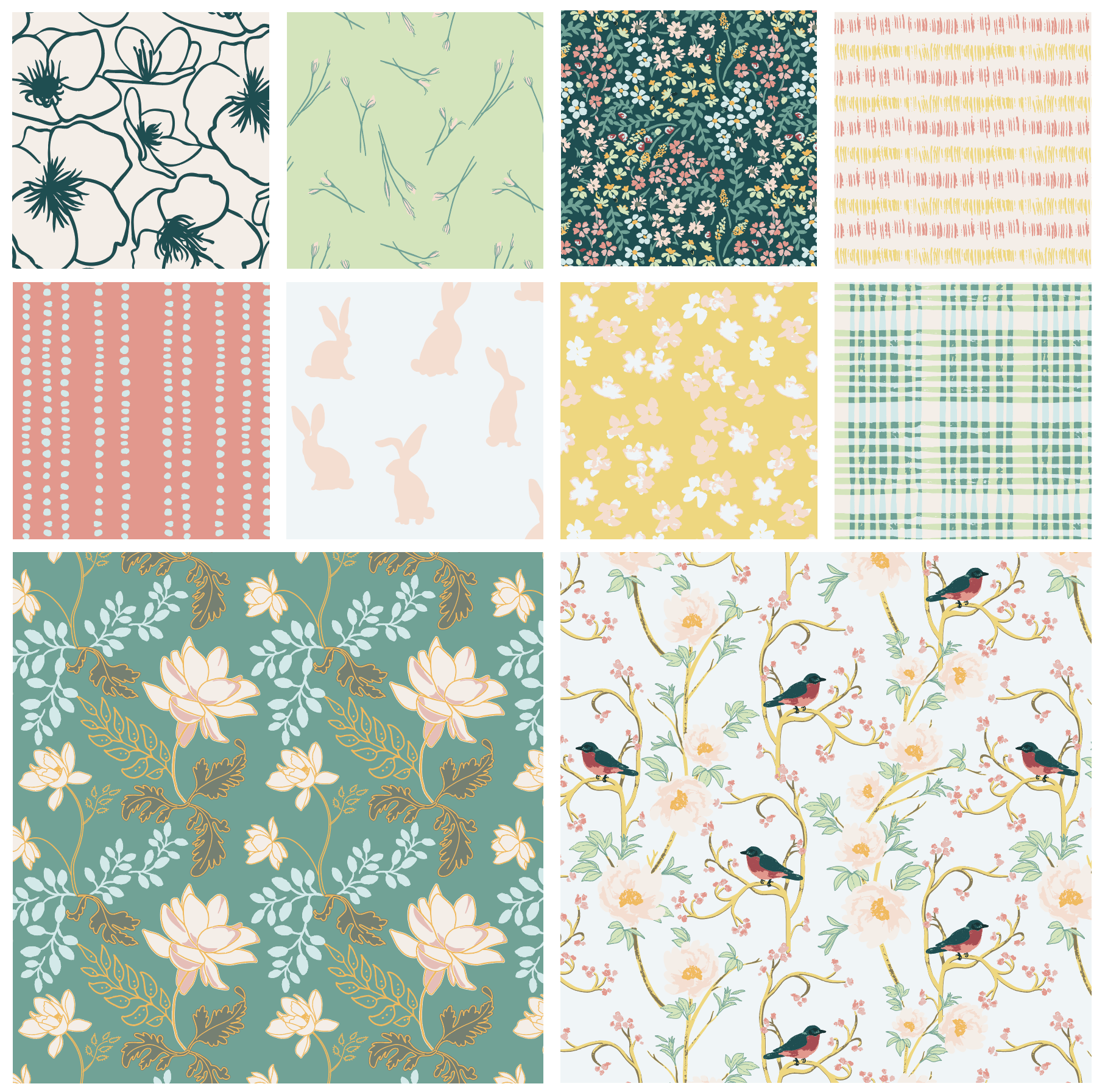
A collection consists of two hero prints…
Bird in Paradise
Royal Lotus
Then there are a variety of blender prints and coordinates…
Dripping Down & Backyard Bunnies
Field Flowers & Scratchy Grass
Little Minis & Picnic in the Park
Sketchy Blooms & Budding Blooms
Looking back I have so much to learn, but looking forward…I am ready to leap!