
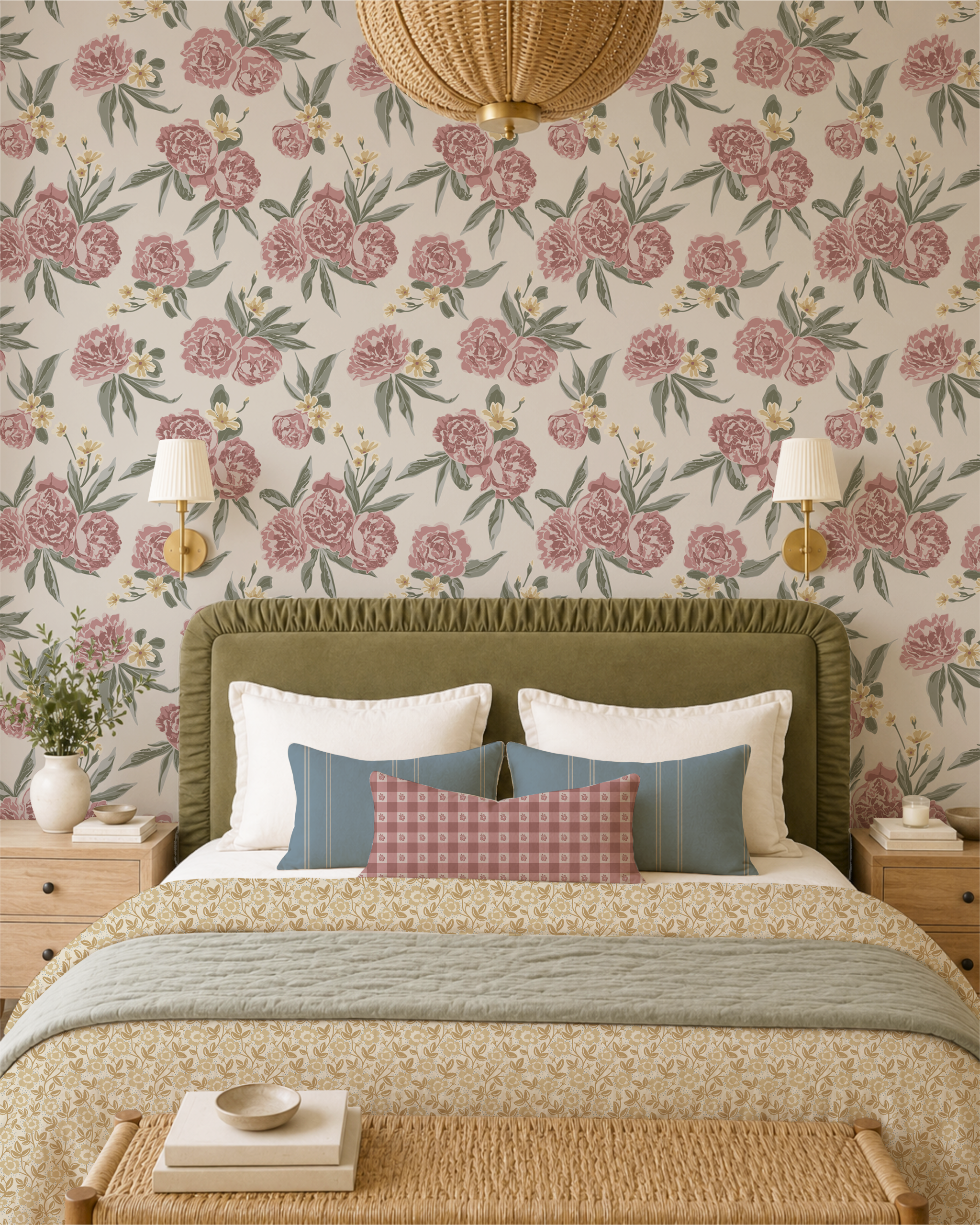
How to Pair Romantic Florals and Small Prints Without Making a Room Feel Busy
Learn how to pair romantic florals with smaller prints using scale, colour and quiet spaces to create a warm, layered room that feels collected rather than busy.
There is something especially inviting about a room filled with pattern. Florals, small prints, stripes and checks can add warmth and personality in a way that solid colours alone often can't. But when several patterns are brought into the same room, it can be difficult to know where to stop.
The key isn't to make every pattern match. It's to give each one a different role. Start with one pattern that leads the room, then build around it with quieter prints that share some of its colours and character.
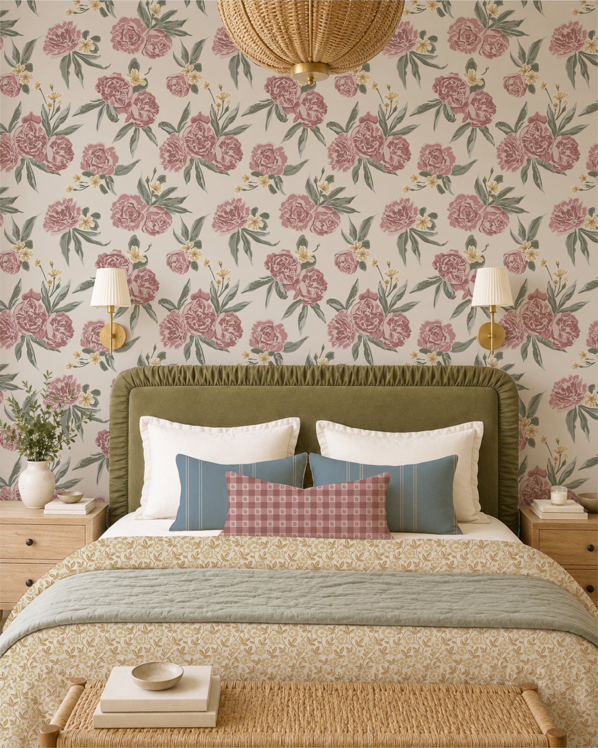
Romantic floral wallpaper
Start with One Floral You Love
Begin with the pattern you most want to see in the room. This might be a floral wallpaper, a duvet, curtains or an upholstered chair.
A larger romantic floral works particularly well as this starting point because it gives you several colours to draw from when choosing everything else.
In Heirloom Bloom, for example, Peony Pathways can take that leading role. Its larger flowers give the room a clear focal point while providing a palette that can be carried into smaller patterns elsewhere.
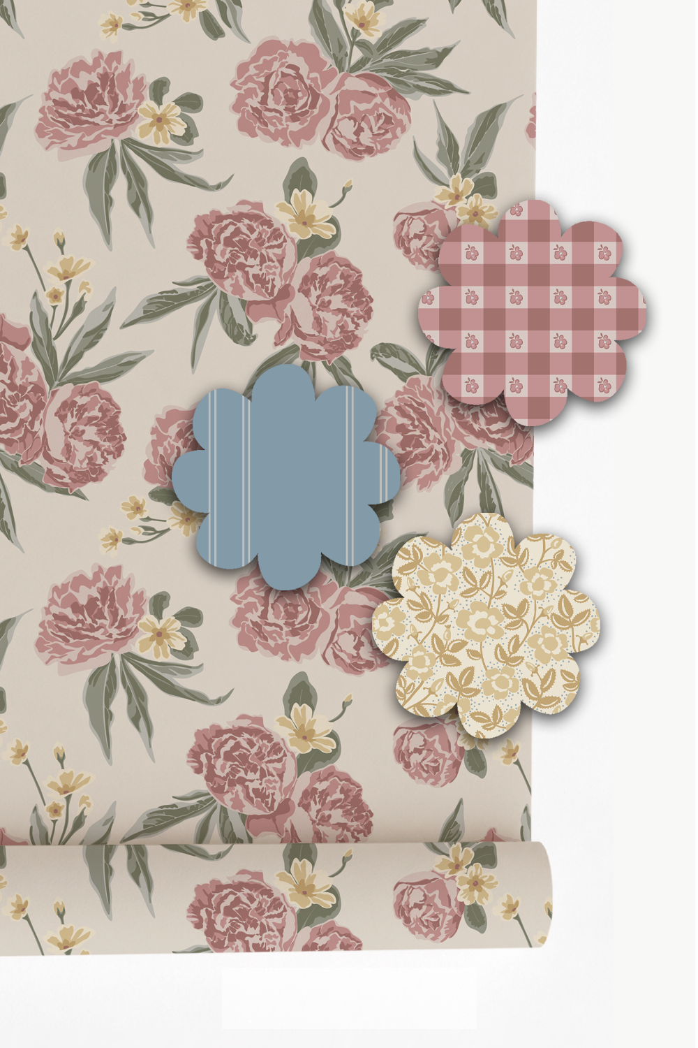
Smaller prints let the hero floral shine
Add Smaller Prints Rather Than Another Competing Pattern
Once you have chosen your main floral, resist the temptation to find another pattern with the same visual strength.
Instead, look for smaller prints that can sit comfortably beside it.
Tiny florals, simple geometrics, ginghams and narrow stripes can all work well because they add interest without competing with the larger floral.
The difference in size is important. When every pattern has similarly sized motifs, they can begin to fight for attention. Pairing a generous floral with something noticeably smaller gives the eye an easy way to move between them.
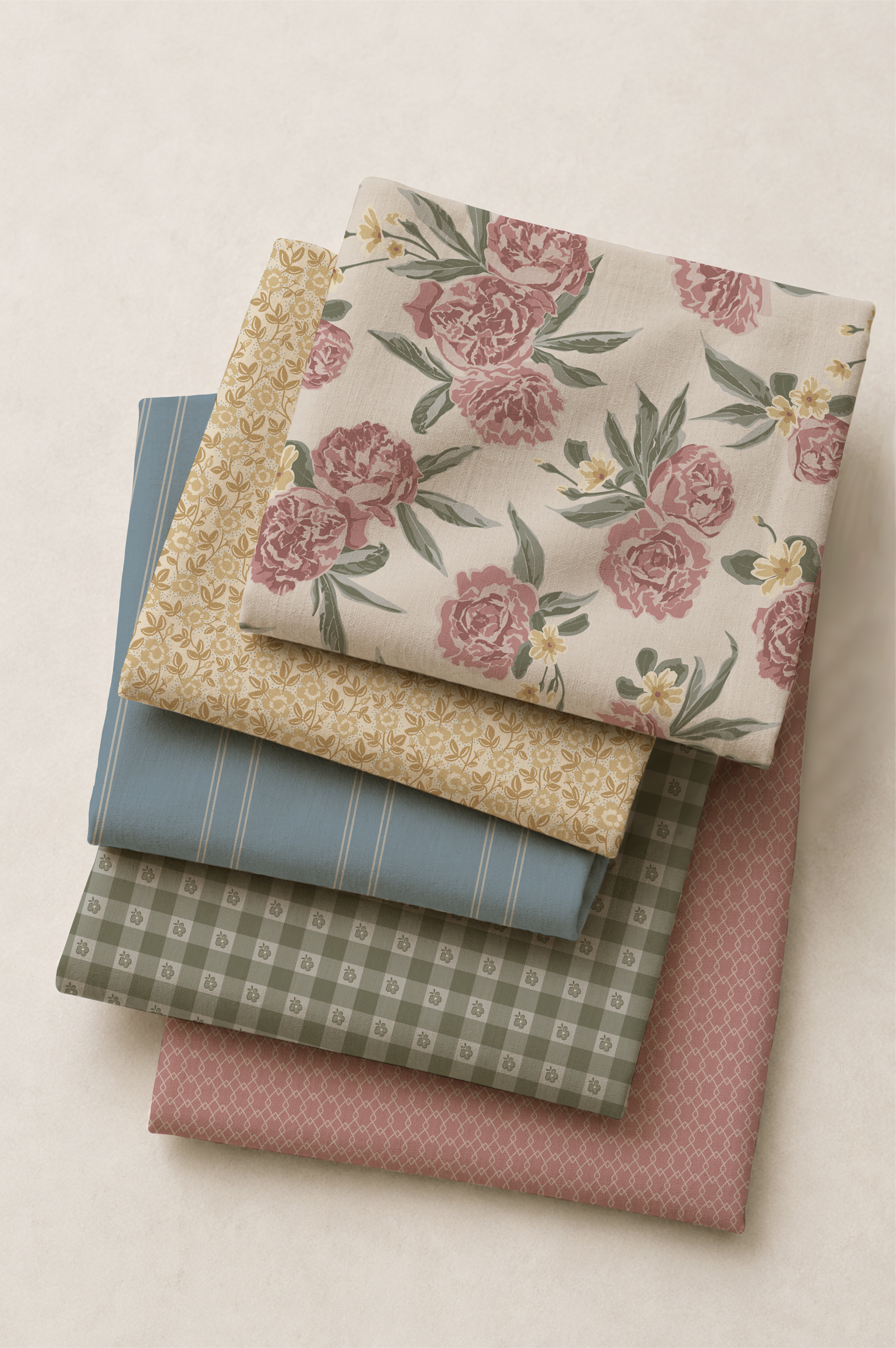
Patterns don't need to contain exactly the same colours to belong together
Let Colour Connect the Patterns
Look for a few colours that repeat throughout the room. A soft green from the leaves of a floral might appear again in a small print. A muted pink might be picked up in another fabric. A warm neutral can quietly run through several patterns.
Those small connections are often enough to make a combination feel intentional without making the room look overly coordinated.
This is also what allows a room to feel as though it has developed naturally over time rather than being purchased as a matching set.
Give Each Pattern a Different Job
Not every pattern needs to cover a large surface.
You might use the leading floral on wallpaper or bedding, then bring smaller prints onto cushions, a Roman blind or an upholstered seat. A stripe, gingham or quiet geometric can appear in smaller amounts elsewhere in the room.
Thinking about patterns this way makes the process much easier: one leads, a few support, and some appear only in small amounts.
It also means you don't have to use every coordinating pattern simply because it belongs to the same collection.
Choose the ones that help the room.
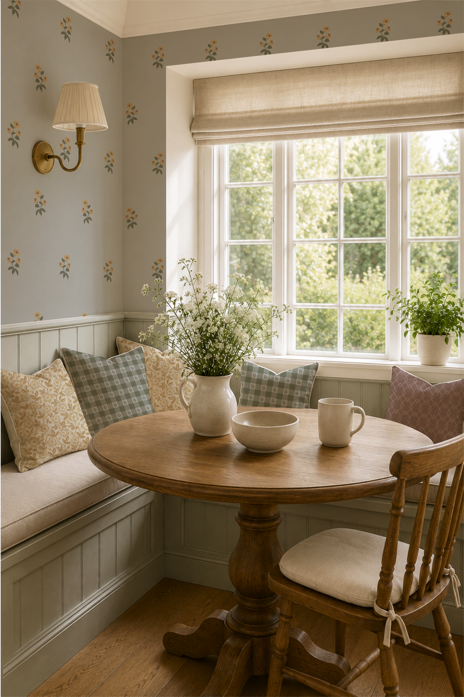
Every surface doesn't need to contain another pattern
Leave Some Quiet Space
One of the easiest ways to make several patterns work together is to give them something quiet to sit beside.
Painted walls, simple bedding, natural wood, an antique dresser, a plain lampshade or an unpatterned upholstered piece can all provide visual breathing room.
This doesn't mean the room needs to become neutral. It simply means that every surface doesn't need to contain another pattern.
In a character-rich room, those quieter elements are often what allow the florals to stand out.
See the Idea in Heirloom Bloom
I designed Heirloom Bloom around this kind of relationship between patterns.
Peony Pathways brings the larger romantic floral, while smaller florals, gingham, ticking and quieter geometric patterns offer different ways to layer pattern into a room without asking every design to be the centre of attention.
You don't need to use them all together. Instead, begin with the pattern you love most and choose one or two quieter companions from there.
The result can still be richly patterned, but it feels comfortable rather than busy—a room where the individual pieces belong together without looking overly matched.
If you'd like to see how the patterns work together, explore the Heirloom Bloom collection and choose the combination that feels right for your own room.
How to Create a Cottagecore Bedroom That Feels Like a Cozy Escape

Bedding and wallpaper by rePaperedShop
There’s something magical about a cottagecore bedroom — a space where time slows, morning light filters through soft curtains, and every texture whispers comfort.
This look is all about simple pleasures, natural materials, and nostalgic charm. This is not just a trend that will soon wane, but an aesthetic that people are craving in their homes, a way to bring in the cozy factor. Whether you live in the countryside or an urban apartment, you can bring that serene, curated atmosphere to your bedroom.
Here’s how to capture the heart of cottagecore through color, materials, vintage charm, lighting, and the art of bed layering.
1. Start with a Soft, Nature-Inspired Color Palette
Cottagecore begins with color — gentle hues that reflect the countryside itself.
Think buttercream, soft sage, dusty rose, muted sky blue, and natural linen tones.
Choose off-whites over bright whites for warmth.
Add contrast through wood tones, aged brass, or pale stone.
Paint your walls or furniture in muted pastels — faded pink, fern green, or robin’s egg blue — to instantly set a vintage mood.
A floral wallpaper behind the bed can anchor the palette beautifully.
2. Use Natural Materials & Cozy Textures
Cottagecore celebrates tactile comfort — things that feel good to touch.
Layer cotton, linen, and wool for depth and softness.
Opt for solid wood furniture with visible grain or a weathered patina.
Use woven baskets, rattan lampshades, and jute rugs for organic texture.
Keep materials breathable and eco-friendly: cotton sateen sheets, linen curtains, or a handmade quilt folded at the foot of the bed.
Add a few dried flower arrangements or branches in ceramic vases for a grounded, natural touch.
3. Add Vintage Accents & Repurposed Finds
A cottagecore bedroom tells a story — and nothing says story like well-loved pieces.
Mix in thrifted furniture: an antique mirror, a curvy dresser, or a chipped side table.
Stack old books beside the bed, display pressed flowers in glass frames, or hang botanical prints.
Use lace doilies, embroidered linens, and heirloom ceramics to give the space soul.
The secret: nothing needs to match perfectly — imperfections create charm and authenticity. There is nothing quite like finding that one-off piece (hello old wooden stacked picture frame) to bring a special feel to your space!
4. Create Gentle, Warm Lighting
Soft lighting turns an ordinary room into a sanctuary.
Forget harsh overheads — think lamps, candles, and string lights that glow like firelight.
Use lamps with pleated or fabric shades for a diffused glow.
Layer candles of different heights on a vintage tray or windowsill. Or, try real wax battery-operated candles for the same glow but no harmful chemicals.
Hang fairy lights around a mirror or canopy for a subtle sparkle.
Choose warm bulbs (2700K or lower) for golden light that flatters everything it touches.
5. Style a Bed Worth Dreaming In
The bed is the centerpiece — and in cottagecore style, it should feel effortlessly inviting.
Layer textures: start with crisp cotton sheets, then add a quilt, and top with a light duvet or comforter.
Choose bedding with florals, checks, or ticking stripes — or mix them for personality.
Add a row of pillows in varying sizes with ruffled edges, embroidery, or lace trim.
Drape a knitted throw or linen blanket over the end for that lived-in charm (extra points if you have thrifted it).
A vintage-style iron or wood headboard completes the romantic look.
Cottagecore decorating isn’t about perfection — it’s about presence. Each chipped teacup, creased linen, or glowing lamp tells a quiet story of comfort and care. When you fill your bedroom with natural textures, vintage treasures, and soft light, you’re not just designing a space — you’re creating a daily retreat from the rush of modern life. And everyone needs a cozy escape at the end of the day!
What Is Cottagecore?

Heirloom Bloom Pattern Collection by repaperedshop
It’s a word we are all hearing these days. Whether you are seeing it on Instagram, reading about it in magazines, or your friends are all remaking their homes up in this aesthetic, this style is surging. But what is it anyway?
Cottagecore is an aesthetic and lifestyle movement that romanticizes rural living, simplicity, and a close connection to nature. It’s inspired by an idealized version of the countryside — think cozy cottages, wildflowers, handmade goods, and slow, mindful living.
It is defined by 4 core themes:
Simplicity & Slowness: Emphasis on a slower pace of life — baking bread, gardening, reading by candlelight, and enjoying quiet moments.
Nostalgia: Draws on an imagined past — often 19th- or early 20th-century rural life — free from modern chaos.
Nature Connection: Outdoor life, wildflowers, woodland walks, farm animals, and harmony with the earth.
Craftsmanship: Appreciation for handmade, vintage, and sustainable items — embroidery, pottery, quilting, and sewing.
Cottagecore is also made visually appealing in a variety of ways. We are seeing soft and muted palettes (think creams, sage greens, dusty roses, warm browns, & buttery yellows), and in specific pattern styles (florals, gingham, toile, chintz, lace, and natural textures like linen or cotton), and in décor it is showing up as vintage furniture, botanical prints, antique crockery, cozy textiles, and natural materials (wood, clay, stone).
Cottagecore is not just a style — it’s also a mindset. It celebrates contentment, sustainability, and nostalgia for a world that feels slower and more intentional. It’s a gentle rebellion against modern consumerism and technology overload, offering peace through simplicity and self-sufficiency. This is where all the thrifters are hanging out!
This pull towards a cottagecore aesthetic does not seem to be going anywhere, but rather is getting stronger! Are you feeling drawn in by this cozy homey vibe?