
Soft Blue Floral Wallpaper For a Timeless Cottage Bedroom
Breathe new life into your bedroom walls with this soft blue floral wallpaper, styled here with cozy bedding and a classic wood nightstand for a warm, lived-in cottage look. Imagine waking up to a light-filled space where delicate florals, golden tones, and elegant details work together to design your dream space—calm, welcoming, and effortlessly put‑together.
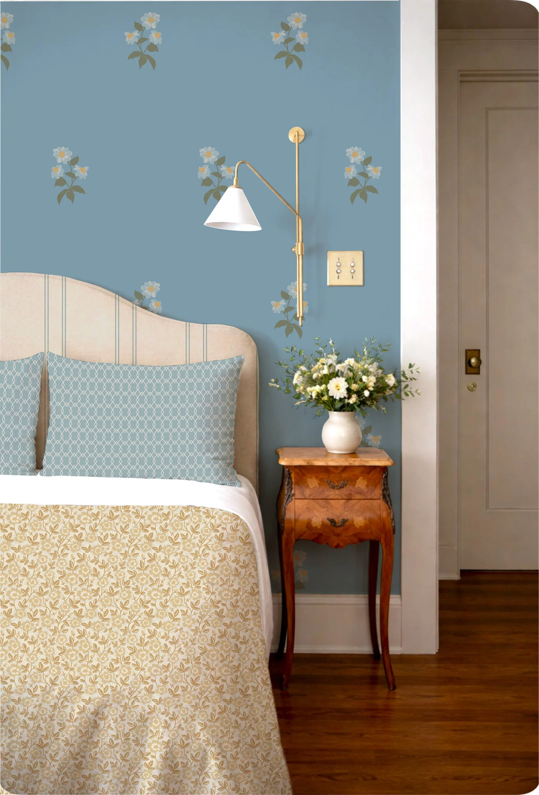
A cozy cottage-inspired bedroom featuring soft blue floral wallpaper on the main wall, golden floral bedding, blue geometric pillows, and a vintage wood nightstand with a simple brass wall sconce—an easy, refined way to style bedroom walls.
This wallpaper design features a scattered floral motif on a soft, muted blue ground—perfect for bedroom walls, a feature wall behind the bed, or a gentle statement in a guest room. The florals are small to medium scale, with clusters of simple blossoms and leafy stems spaced so the pattern feels airy rather than busy. That spacing keeps the look calm and collected, ideal for a relaxing sleep space.
The color palette leans into soft neutrals and blue shades: a dusted blue background paired with warm cream and gentle golden tones in the flowers and leaves. This palette fits beautifully within a Warm Minimalism and Heritage Revival cottage style—think subtle pattern, thoughtful details, and a timeless, slightly traditional mood.
In this moodboard, the floral wallpaper is paired with an upholstered headboard featuring classic stripes, golden floral bedding, and a petite vintage nightstand. Those elements highlight how well this pattern suits a modern cottage or traditional country interior. It feels tailored but not formal, cozy but not cluttered. Picture it in a Craftsman bungalow bedroom, a country home, or a vintage eclectic interior where you want a soft & serene backdrop that still has personality.
For shoppers, this design works wonderfully if you’re searching for floral prints for bedroom walls, modern cottage wallpaper, or a subtle pattern that adds interest without overwhelming small rooms.
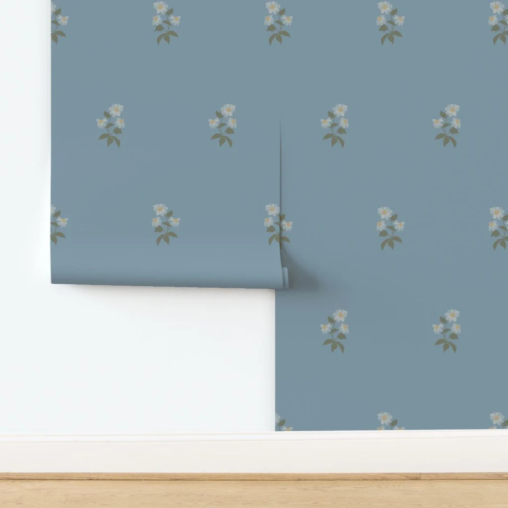
Large Blockprint Coneflower Wallpaper in Deep Blue
How to style this wallpaper in your home
Choosing the Right Furniture
To curate this look in your own bedroom, start with furniture that leans classic and slightly vintage. A gently curved upholstered headboard, like the one in the moodboard, keeps the room soft and inviting. Look for neutral fabrics—linen-look creams, warm beige, or soft oatmeal—that let the blue floral wallpaper stay the star.
Pair the bed with a small wooden nightstand in a warm wood tone (walnut, cherry, or oak). Cabriole legs, inlay, or subtle carved details all echo the Heritage Revival feel. If your style is more modern cottage, you can swap the ornate nightstand for a simple Shaker-style table in a honey stain for an understated, polished look.
For dressers and chests, warm wood or painted finishes in cream, greige, or soft sage work seamlessly with the blue background and golden accents in the wallpaper.
Layering Textures
Layered textures make this wallpaper feel extra cozy and lived‑in. In the moodboard, you can see how the patterned bedding and upholstered headboard add dimension without competing with the walls.
Try mixing:
A quilt or duvet with a small-scale floral or leafy print in warm neutrals (similar to the golden floral bedding shown).
Smooth cotton or linen sheets in white or ivory to keep things light and breathable.
A couple of accent pillows in a subtle geometric pattern or stripe—in soft blue, light steel blue, or orchard blue—to tie into the wall color.
Add a wool or cotton throw at the foot of the bed for a snug, layered finish. The goal is a warm minimalist approach: just enough pattern and texture to feel curated and cozy, without visual clutter.
Accent Decor Ideas
Accent decor is where you can really personalize this look and express your style. A simple white vase filled with seasonal flowers, like in the moodboard, adds a fresh, botanical touch that echoes the wallpaper motif.
Consider:
Framed botanical prints or simple line drawings in slim gold or wood frames.
A small stack of favorite books on the nightstand for a relaxed, intimate vibe.
A soft area rug in a muted pattern—think cream and light blue, or a subtle stripe—to ground the bed and warm up hardwood floors.
Vintage-inspired accessories like a small alarm clock, a ceramic dish for jewelry, or a linen-covered box for bedside storage.
Keep decor thoughtfully chosen so the room feels curated rather than crowded, especially if you’re aiming for a warm minimalist bedroom.
Lighting Tips
The brass wall sconce in the moodboard is a perfect example of how lighting can add a luxe look without feeling fussy. Look for lighting in warm metals—brass, brushed gold, or antique bronze—to echo the warm tones in the floral pattern.
For bedroom lighting:
Install wall sconces or plug‑in swing-arm lamps on either side of the bed for a tailored, hotel-inspired feel.
Use warm white bulbs (around 2700K–3000K) to keep the room soft and serene rather than harsh or cool.
Add a small table lamp on the nightstand if you prefer layered lighting. A simple white or linen shade will keep things classic and easy to style.
Good lighting highlights the soft blue walls and creates an instantly inviting atmosphere, especially in the evenings.
Placement Tips
This floral wallpaper is versatile enough for both accent wall and full-room installs:
Accent wall: Use it behind the headboard as shown. This works brilliantly in small bedrooms or apartments where you want instant impact without committing every wall to pattern.
Full room: For larger bedrooms or guest rooms, wallpapering all the walls can create a cozy, cocooning effect that still feels airy thanks to the spaced floral repeats and soft colors.
Ceiling option: If you’re feeling playful, you could even add it to a low, flat ceiling in a small bedroom for a subtle “tent” effect—just pair with plain walls to keep it refined.
For renters or those planning a quick update, this pattern is especially effective on bedroom feature walls, small guest rooms, or even dressing rooms where a simple makeover makes a big impact.
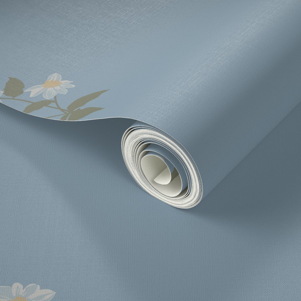
Hand-drawn coneflowers on soft blue wallpaper
About the wallpaper
This design is shown on a peel and stick wallpaper base, but there are other options available as well. Either way, it’s thoughtfully designed to be easy-to-style and practical for everyday living.
For bedroom walls, the soft blue floral pattern:
Creates a calm, restful backdrop that supports better relaxation and sleep.
Works beautifully with a wide range of bedding colors—from white and cream to soft gold, muted green, and dusty blue.
Offers instant impact even in smaller rooms where you may not have space for a lot of decor.
If you choose a removable wallpaper option, it’s a fuss-free way to try something new without the long-term commitment—ideal for renters, style-shifters, or anyone who likes to refresh their space every few years. For homeowners, a traditional paste-the-wall paper can be a built-to-last, premium-quality choice for a primary bedroom or guest suite.
This pattern is especially appealing to shoppers looking for:
Floral prints for bedroom walls
Cottage or Heritage Revival interiors
Calm, colorful, yet subtle wallpaper for a primary or guest bedroom
A quick and easy makeover that feels thoughtfully designed and sophisticated
Bring this soft blue floral wallpaper home
If you’re picturing this bedroom in your own home, you’re not alone. This soft blue floral wallpaper is a simple way to refresh your space and create a welcoming atmosphere that feels both timeless and current.
Use it on your bedroom accent wall to give the bed an instantly inviting backdrop, or style it in a guest room with layered linens and warm wood furniture for that “cozy country home” feeling. Mix & match it with your favorite bedding, personalize the room with meaningful decor, and let the gentle florals set the mood.
Ready to style it your way? Get the look of this soft blue floral wallpaper for bedroom (or other) walls—perfect for a quick update that feels thoughtful, elegant, and easy to live with.
How to Pair Romantic Florals and Small Prints Without Making a Room Feel Busy
Learn how to pair romantic florals with smaller prints using scale, colour and quiet spaces to create a warm, layered room that feels collected rather than busy.
There is something especially inviting about a room filled with pattern. Florals, small prints, stripes and checks can add warmth and personality in a way that solid colours alone often can't. But when several patterns are brought into the same room, it can be difficult to know where to stop.
The key isn't to make every pattern match. It's to give each one a different role. Start with one pattern that leads the room, then build around it with quieter prints that share some of its colours and character.
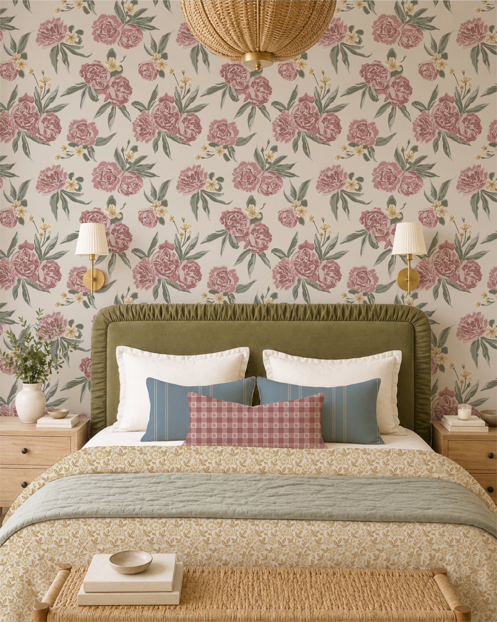
Romantic floral wallpaper
Start with One Floral You Love
Begin with the pattern you most want to see in the room. This might be a floral wallpaper, a duvet, curtains or an upholstered chair.
A larger romantic floral works particularly well as this starting point because it gives you several colours to draw from when choosing everything else.
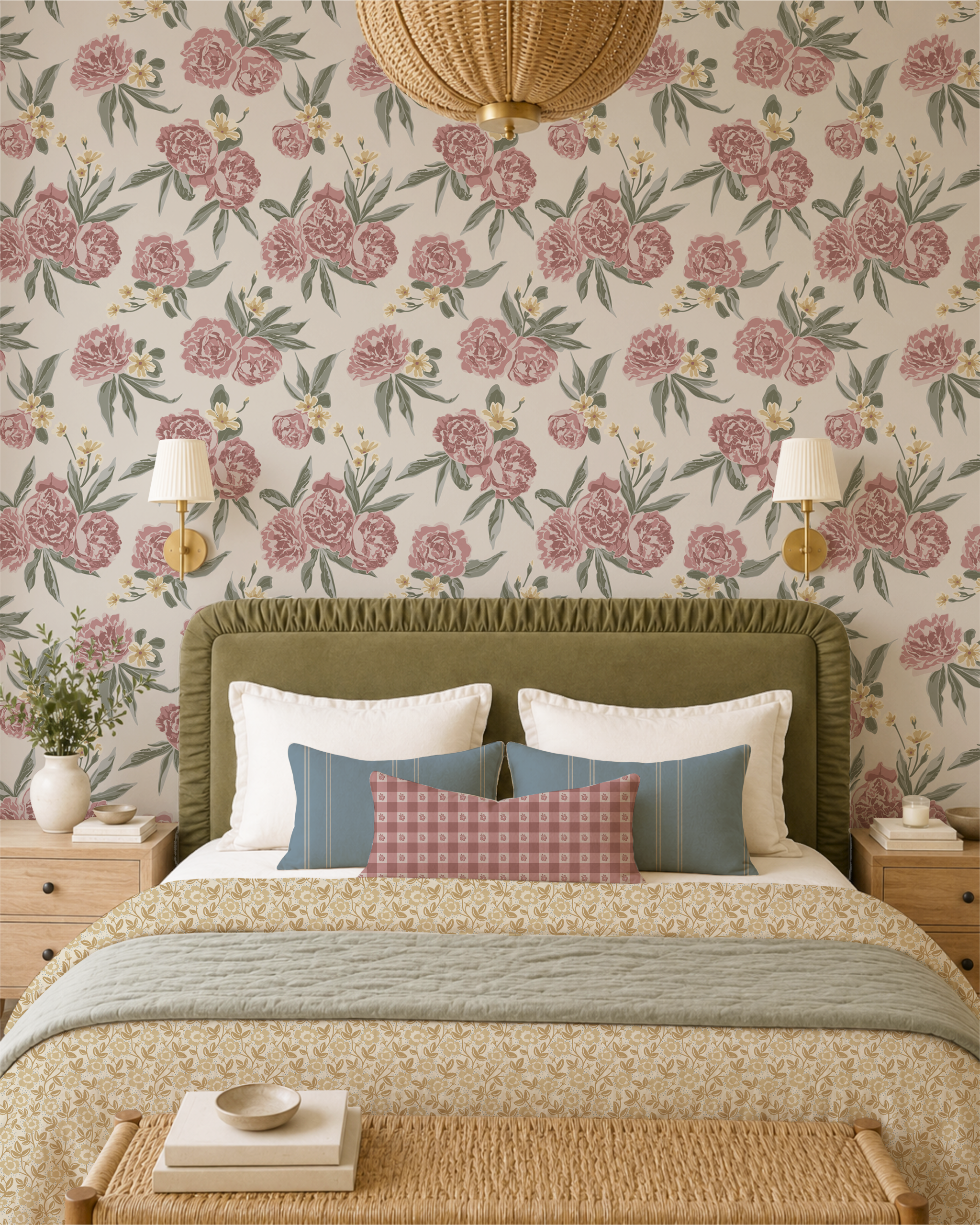
In Heirloom Bloom, for example, Peony Pathways can take that leading role. Its larger flowers give the room a clear focal point while providing a palette that can be carried into smaller patterns elsewhere.
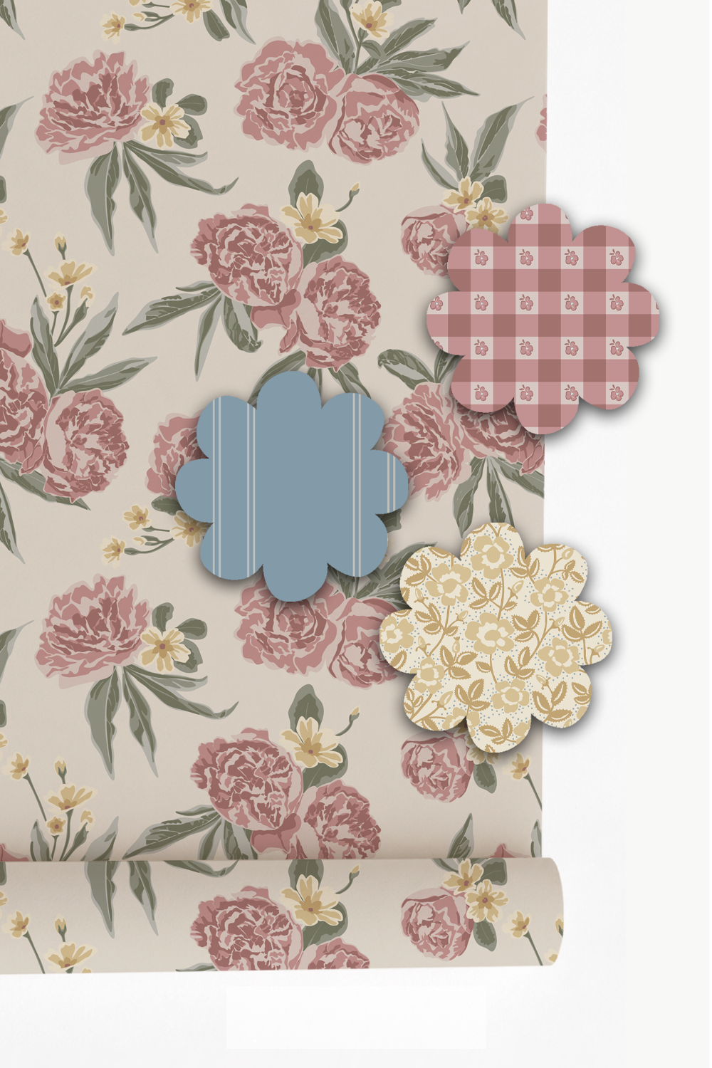
Smaller prints let the hero floral shine
Add Smaller Prints Rather Than Another Competing Pattern
Once you have chosen your main floral, resist the temptation to find another pattern with the same visual strength.
Instead, look for smaller prints that can sit comfortably beside it.
Tiny florals, simple geometrics, ginghams and narrow stripes can all work well because they add interest without competing with the larger floral.
The difference in size is important. When every pattern has similarly sized motifs, they can begin to fight for attention. Pairing a generous floral with something noticeably smaller gives the eye an easy way to move between them.
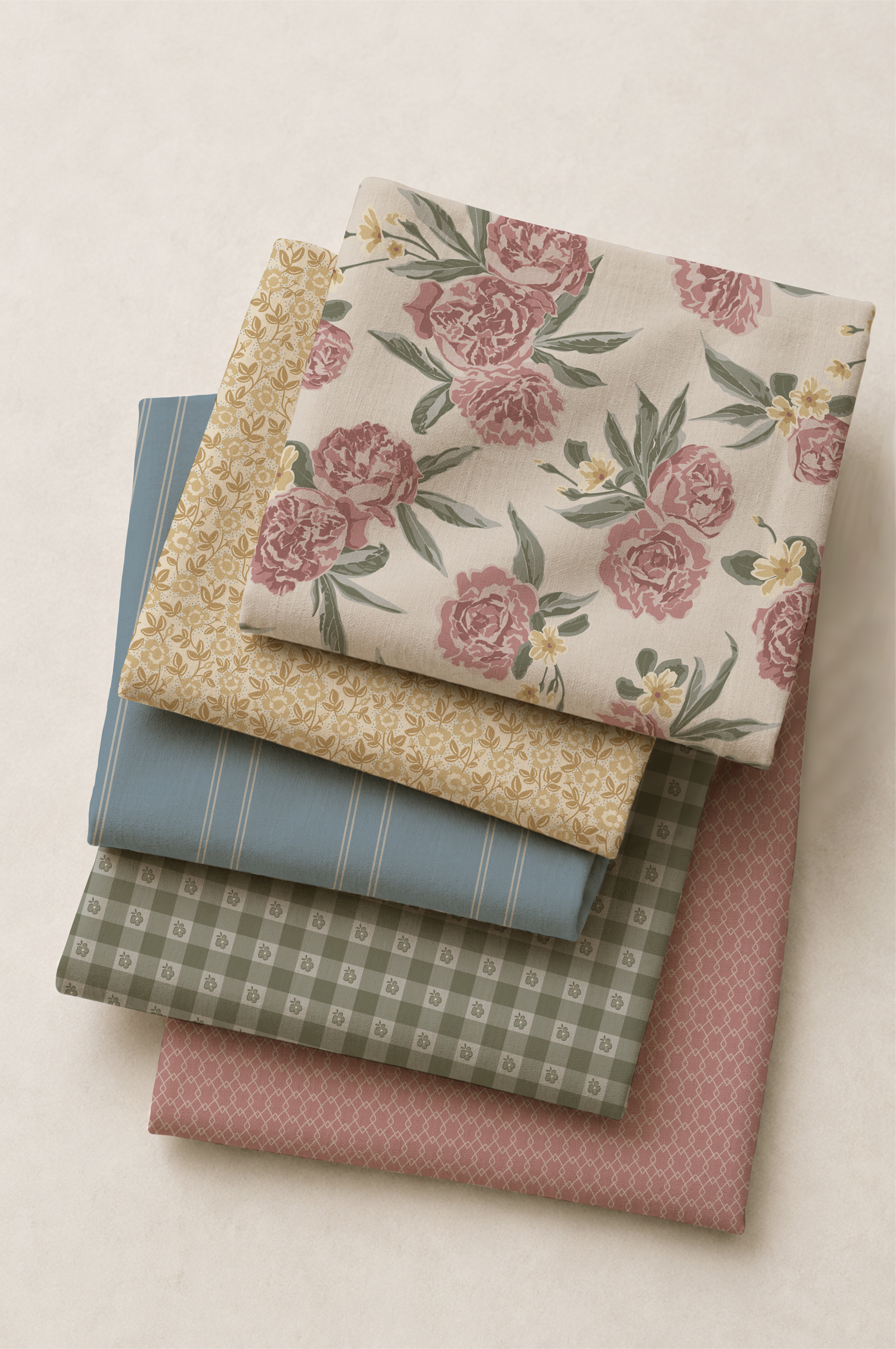
Patterns don't need to contain exactly the same colours to belong together
Let Colour Connect the Patterns
Look for a few colours that repeat throughout the room. A soft green from the leaves of a floral might appear again in a small print. A muted pink might be picked up in another fabric. A warm neutral can quietly run through several patterns.
Those small connections are often enough to make a combination feel intentional without making the room look overly coordinated.
This is also what allows a room to feel as though it has developed naturally over time rather than being purchased as a matching set.
Give Each Pattern a Different Job
Not every pattern needs to cover a large surface.
You might use the leading floral on wallpaper or bedding, then bring smaller prints onto cushions, a Roman blind or an upholstered seat. A stripe, gingham or quiet geometric can appear in smaller amounts elsewhere in the room.
Thinking about patterns this way makes the process much easier: one leads, a few support, and some appear only in small amounts.
It also means you don't have to use every coordinating pattern simply because it belongs to the same collection.
Choose the ones that help the room.
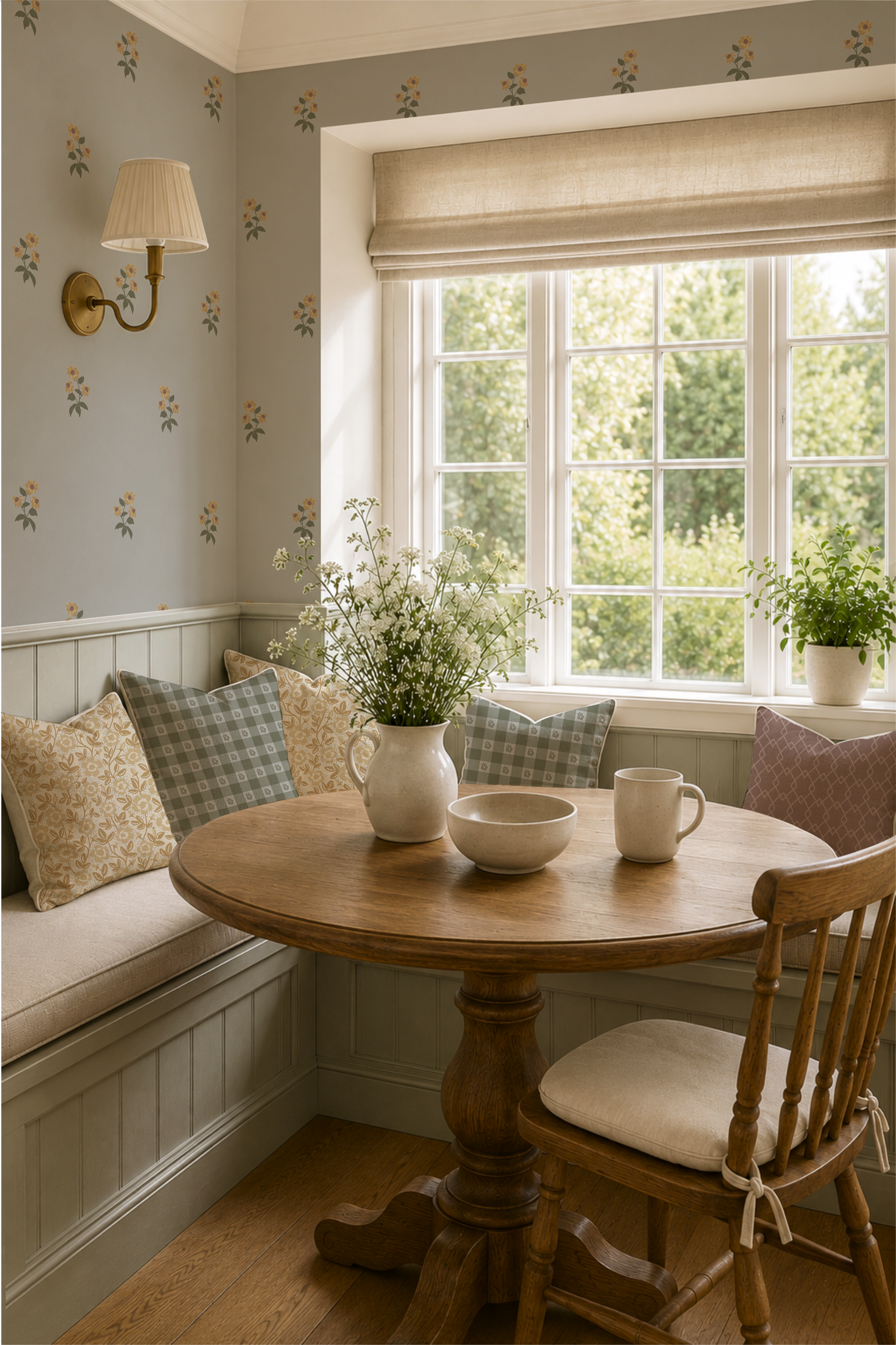
Every surface doesn't need to contain another pattern
Leave Some Quiet Space
One of the easiest ways to make several patterns work together is to give them something quiet to sit beside.
Painted walls, simple bedding, natural wood, an antique dresser, a plain lampshade or an unpatterned upholstered piece can all provide visual breathing room.
This doesn't mean the room needs to become neutral. It simply means that every surface doesn't need to contain another pattern.
In a character-rich room, those quieter elements are often what allow the florals to stand out.
See the Idea in Heirloom Bloom
I designed Heirloom Bloom around this kind of relationship between patterns.
Peony Pathways brings the larger romantic floral, while smaller florals, gingham, ticking and quieter geometric patterns offer different ways to layer pattern into a room without asking every design to be the centre of attention.
You don't need to use them all together. Instead, begin with the pattern you love most and choose one or two quieter companions from there.
The result can still be richly patterned, but it feels comfortable rather than busy—a room where the individual pieces belong together without looking overly matched.
If you'd like to see how the patterns work together, explore the Heirloom Bloom collection and choose the combination that feels right for your own room.
How to Create a Cottagecore Bedroom That Feels Like a Cozy Escape

Bedding and wallpaper by rePaperedShop
There’s something magical about a cottagecore bedroom — a space where time slows, morning light filters through soft curtains, and every texture whispers comfort.
This look is all about simple pleasures, natural materials, and nostalgic charm. This is not just a trend that will soon wane, but an aesthetic that people are craving in their homes, a way to bring in the cozy factor. Whether you live in the countryside or an urban apartment, you can bring that serene, curated atmosphere to your bedroom.
Here’s how to capture the heart of cottagecore through color, materials, vintage charm, lighting, and the art of bed layering.
1. Start with a Soft, Nature-Inspired Color Palette
Cottagecore begins with color — gentle hues that reflect the countryside itself.
Think buttercream, soft sage, dusty rose, muted sky blue, and natural linen tones.
Choose off-whites over bright whites for warmth.
Add contrast through wood tones, aged brass, or pale stone.
Paint your walls or furniture in muted pastels — faded pink, fern green, or robin’s egg blue — to instantly set a vintage mood.
A floral wallpaper behind the bed can anchor the palette beautifully.
2. Use Natural Materials & Cozy Textures
Cottagecore celebrates tactile comfort — things that feel good to touch.
Layer cotton, linen, and wool for depth and softness.
Opt for solid wood furniture with visible grain or a weathered patina.
Use woven baskets, rattan lampshades, and jute rugs for organic texture.
Keep materials breathable and eco-friendly: cotton sateen sheets, linen curtains, or a handmade quilt folded at the foot of the bed.
Add a few dried flower arrangements or branches in ceramic vases for a grounded, natural touch.
3. Add Vintage Accents & Repurposed Finds
A cottagecore bedroom tells a story — and nothing says story like well-loved pieces.
Mix in thrifted furniture: an antique mirror, a curvy dresser, or a chipped side table.
Stack old books beside the bed, display pressed flowers in glass frames, or hang botanical prints.
Use lace doilies, embroidered linens, and heirloom ceramics to give the space soul.
The secret: nothing needs to match perfectly — imperfections create charm and authenticity. There is nothing quite like finding that one-off piece (hello old wooden stacked picture frame) to bring a special feel to your space!
4. Create Gentle, Warm Lighting
Soft lighting turns an ordinary room into a sanctuary.
Forget harsh overheads — think lamps, candles, and string lights that glow like firelight.
Use lamps with pleated or fabric shades for a diffused glow.
Layer candles of different heights on a vintage tray or windowsill. Or, try real wax battery-operated candles for the same glow but no harmful chemicals.
Hang fairy lights around a mirror or canopy for a subtle sparkle.
Choose warm bulbs (2700K or lower) for golden light that flatters everything it touches.
5. Style a Bed Worth Dreaming In
The bed is the centerpiece — and in cottagecore style, it should feel effortlessly inviting.
Layer textures: start with crisp cotton sheets, then add a quilt, and top with a light duvet or comforter.
Choose bedding with florals, checks, or ticking stripes — or mix them for personality.
Add a row of pillows in varying sizes with ruffled edges, embroidery, or lace trim.
Drape a knitted throw or linen blanket over the end for that lived-in charm (extra points if you have thrifted it).
A vintage-style iron or wood headboard completes the romantic look.
Cottagecore decorating isn’t about perfection — it’s about presence. Each chipped teacup, creased linen, or glowing lamp tells a quiet story of comfort and care. When you fill your bedroom with natural textures, vintage treasures, and soft light, you’re not just designing a space — you’re creating a daily retreat from the rush of modern life. And everyone needs a cozy escape at the end of the day!
What Is Cottagecore?

Heirloom Bloom Pattern Collection by repaperedshop
It’s a word we are all hearing these days. Whether you are seeing it on Instagram, reading about it in magazines, or your friends are all remaking their homes up in this aesthetic, this style is surging. But what is it anyway?
Cottagecore is an aesthetic and lifestyle movement that romanticizes rural living, simplicity, and a close connection to nature. It’s inspired by an idealized version of the countryside — think cozy cottages, wildflowers, handmade goods, and slow, mindful living.
It is defined by 4 core themes:
Simplicity & Slowness: Emphasis on a slower pace of life — baking bread, gardening, reading by candlelight, and enjoying quiet moments.
Nostalgia: Draws on an imagined past — often 19th- or early 20th-century rural life — free from modern chaos.
Nature Connection: Outdoor life, wildflowers, woodland walks, farm animals, and harmony with the earth.
Craftsmanship: Appreciation for handmade, vintage, and sustainable items — embroidery, pottery, quilting, and sewing.
Cottagecore is also made visually appealing in a variety of ways. We are seeing soft and muted palettes (think creams, sage greens, dusty roses, warm browns, & buttery yellows), and in specific pattern styles (florals, gingham, toile, chintz, lace, and natural textures like linen or cotton), and in décor it is showing up as vintage furniture, botanical prints, antique crockery, cozy textiles, and natural materials (wood, clay, stone).
Cottagecore is not just a style — it’s also a mindset. It celebrates contentment, sustainability, and nostalgia for a world that feels slower and more intentional. It’s a gentle rebellion against modern consumerism and technology overload, offering peace through simplicity and self-sufficiency. This is where all the thrifters are hanging out!
This pull towards a cottagecore aesthetic does not seem to be going anywhere, but rather is getting stronger! Are you feeling drawn in by this cozy homey vibe?
Starting Small With Wallpaper

Floral Duet Wallpaper
Wallpaper is showing up more and more in home decor since people are wanting to personalize their spaces. Enough of the sterile white kitchens! But where are the best places to install wallpaper if you just want to start small?
ACCENT OR FEATURE WALL
Typically in a living room, dining room, or bedroom, a feature wall gives a focal point without overwhelming the whole room. Simply decide which wall is most visible when entering the room, and/or best seen from other rooms. Since it is only one wall, you can choose something as bold or subtle as you want. Both will work for an accent wall.POWDER ROOM OR HALF BATH
Have you seen the trend to wallpaper an entire half bathroom? So impactful! This is an opportunity to go bold or dramatic without it being ‘too much’. Surprisingly, papering a small space does not make it feel smaller but makes a statement that draws people in. With a smaller room, there it less material required and therefore costs less.BEDROOMS
Hanging wallpaper in a bedroom makes a statement on the wall behind the head of the bed or even behind the dresser. Here you can choose to just paper one wall like an accent wall or paper the entire room. One caution would be to choose a pattern that is more on the soothing side as you still want to invite sleep. To save costs on papering the entire room, consider doing a bead board wainscoting on the bottom of the wall (less costly than wallpaper), and then applying wallpaper around the top half of the room. Or, if you are bold enough, try papering the ceiling!HALLWAYS, ENTRYWAYS, FOYERS
These are transition spaces where wallpaper can set the tone and interest without needing full-wall coverage. You can choose to paper only one wall or a portion of all walls. For example, in an entryway try wallpapering the lower half of the wall and painting the upper half, adding a beautiful wood trim (inexpensive) to cover the transition between the two. With wallpaper on the lower half of high traffic spaces it can also help to protect walls from general wear.STUDY AREA, READING NOOK, BEHIND BOOKCASES
Other small areas of the home can be emphasized with a little wallpaper too. A cantilevered space with a small table and chairs would make a great study or breakfast space and it would be elevated with a splash of wallpaper to define the area. The same goes for a reading nook, if you are fortunate enough to have one. Many homes have a fireplace with recessed spaces on either side and, to balance it all out, bookcases are placed in those spaces. But instead of a plain painted wall, try adding wallpaper behind the bookcases to draw in the eye and yet not overwhelm the entire room.
BACKS OF SHELVING, INSIDE BOOKCASES, SMALL NICHES
These are often overlooked places to install wallpaper but they are perfect for adding a pop of pattern. If you want to just start small or unsure of what you would like as a wallpaper, this may be a great place to start.
So whether you are hesitant to hang your first panel of wallpaper or wanting to save some costs, consider starting small with some of these spaces. Whatever you decide, you will be taking a step toward making your home more you!
How to Measure a Room for Wallpaper

Repapered Bedding with Spring Unfolded Collection
Have you noticed that the trend for wallpaper has been increasingly popular?
You may remember that in the early 2000s wallpaper had a bad rap. It was mainly driven by changing design trends and the challenges associated with older wallpaper materials and installation. Many of the patterns from the '80s and '90s—floral motifs, heavy damasks, and gaudy prints—felt outdated and too busy. Wallpaper designs seemed old-fashioned and out of touch. But one of the biggest turn-offs for homeowners and renters alike was the difficulty in removing wallpaper. Older wallpapers were often glued down with strong adhesives, and peeling or stripping them off could be a time-consuming and frustrating task, often leaving behind remnants that required hours of cleaning and scraping. This made many people hesitant to use wallpaper in their homes.
However, like most styles, wallpaper has come full circle and returned with a flourish. Due to new trends like peel-and-stick wallpaper, advances in digital printing, and a shift toward personalized, unique designs, wallpaper is now viewed as a fun, customizable option that can add texture, color, and personality to a space without the same drawbacks as the past.
So today if you find yourself scooped up in this super-fun trend BUT are feeling overwhelmed then let me show you how to start!
Measuring your wall(s) accurately is the first step. Always measure the tallest point of the wall and the widest point of the wall as in the diagram below. You do not need to include baseboards. Also, do not subtract for windows or doors as this will simply be trimmed out when applying the wallpaper to the wall.

Always measure the tallest and widest point of the wall for wallpaper
Wallpaper is printed in such a way that the pattern lines up perfectly based on the length of the roll. So when you begin applying the wallpaper on a basic wall, start at the top of the wall and proceed from left to right. That way, when you begin again at the top of the wall with the next sheet, the repeat pattern will match the previously applied sheet.
Pattern Mixing with Spring Unfolded

Pattern mixing with Spring Unfolded
Each of my pattern collections begins with a story.
Spring is a favourite time of year for me as we finally emerge from a seemingly never-ending winter. I was anticipating an early spring by working on this collection, so the story goes like this…
After a long season of closed windows and quiet indoors, Spring Unfolded captures the joy of stepping back into the open air. This collection is inspired by best friends gathering for a cheerful picnic - a blanket laid across fresh grass, the gentle hum of conversation, and the unmistakable feeling that life is blooming again…it’s a celebration of friendship, fresh air and the simple joy of spring arriving once more.
While working on this collection (mostly on days when the snow was still swirling outside my window) I was envisioning all my favourite things about spring. But foremost, I attempted to capture the feeling of being free of the indoors. For me, this meant walking my acreage and discovering new blooms daily and so this collection features an array of florals. Longing for floral patterns everywhere, I created a variety of designs that would compliment one another, excited by the opportunity to intermix these florals. Tiny simple blooms, large busy clusters, and trailing florals speak to one another without becoming overwhelming.
So go ahead…mix and match those flowers, and release the joy that it brings!
Restarting...Again

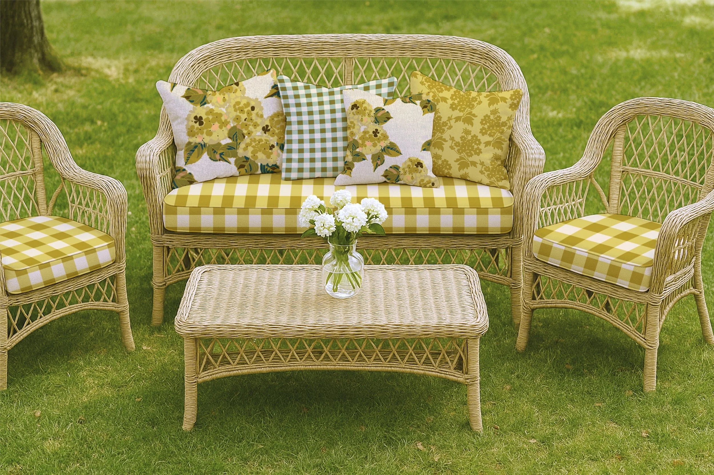
Patio cushions featuring the Spring Unfolded fabric collection
Wow…how many times does it take to get going you ask?
Well, I guess until I get it right.
At the start of 2025 I finally gained traction with all things related to this small business. Right now I am operating it as a side gig as I still have full time employment five days a week. Instead of making all the excuses or even recounting, yet again, the proclamations and declarations of restarting, I am simply picking up where I currently find myself.
It is June and I have made more progress than ever before (patting myself on the back over here). I have designed two complete pattern collections, started a Spoonflower shop, rebranded my existing Etsy shop for home decor items (previously paper items - journals, notebooks, cards, etc.), began creating Reels for my Instagram account, updated my pattern collections to my Portfolio on my website, and started a Pinterest business account.
The learning curve has been steep. My goals are small and spread apart so that I cannot fail or will not abandon ship. I have kept it all manageable & in bite-sized pieces. I do not want to restart for the fourth (or is it the fifth) time.
So here we are in June and I am smiling…
Next Steps
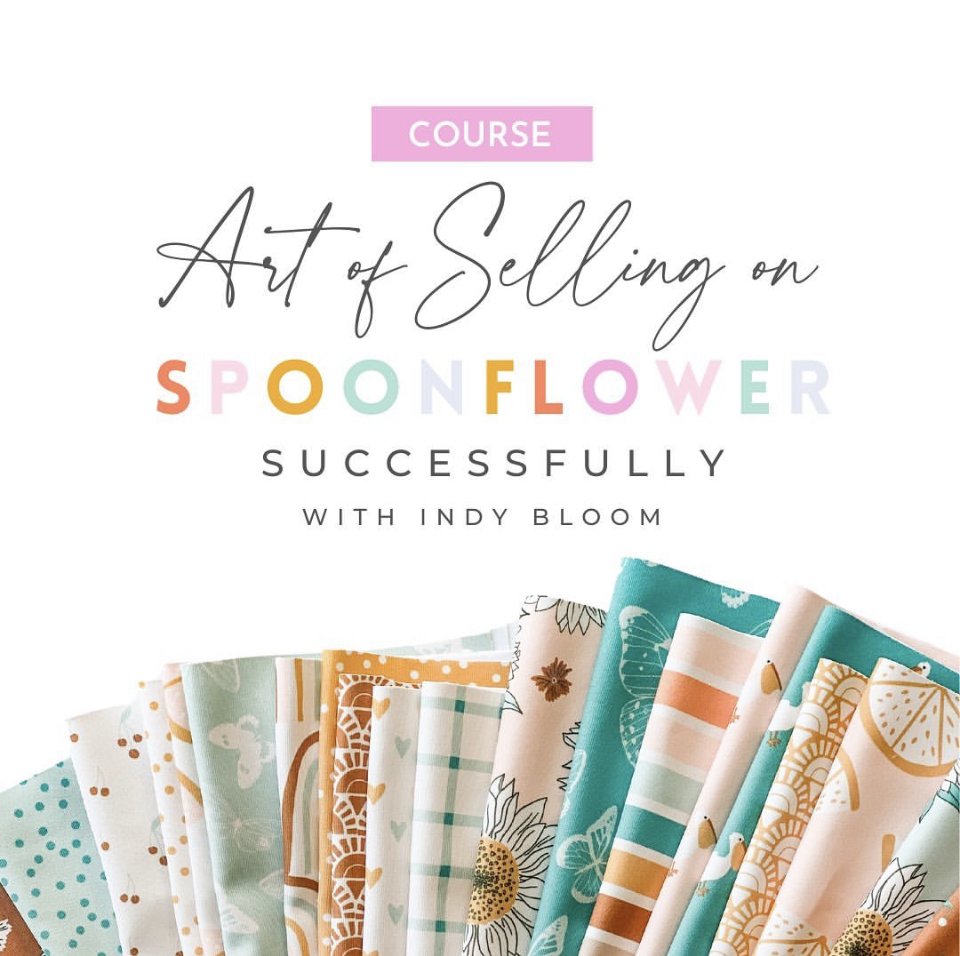
A mini course I recently took
Last week I took this mini course offered through Indy Bloom on IG and it was the motivation that I needed.
After the happenings in my life over the past 2 years I have had a few false starts at getting back into surface pattern design. My heart is there. But my creativity isn’t. I’ve tried creating again and it just falls flat. So I have been giving myself some grace to get myself going creatively again.
Mindy, from Indy Bloom is a superstar at selling her patterns on Spoonflower. She has figured it out! And she is making a nice profit from her designs. She offered this mini course as a hook for her more in-depth course on designing and selling on Spoonflower and it began to stir something in me again. As I thought about it I realized that even though I may not be ready to jump right in with creating a new pattern collection, I can upload my previous designs to Spoonflower and offer them for sale!
I started repaperedshop already on Spoonflower, before my life spiraled, by uploading two different pattern collections and making them available for sale. But I didn’t really know what I was doing. Now, having taken this little inspirational course, I have new thoughts and a renewed fervour for moving forward.
So, with a little motivation in my pocket, I will take the next step…
New Beginnings

So I have a confession to make…
I have had some significant changes in my life over the last year. And they’ve been hard. And all the creativity drained right out of me.
But I am not letting that hold me down. Out of the grief and misery there has also been light and life. I moved out into the country and it has been the greatest gift! There is so much sky. There are so many plants and creatures and colours. We are up on a hill and look down onto lots of green and a lovely pond rimmed with cattails. I didn’t know how badly I needed this until I was here.
This is the perfect mixture of inspiration that I needed to get my creativity back. So my next pattern collection is coming and it will reflect all the things that have been healing me lately. Out here in my house on the hill in the country!
Welcome Back
It has been a minute (or several years) since I have added to this blog, but it surely is time.
This past year has brought several life changes for me. As such, my time and creativity were limited. However, I am back and ready to share with you again!
The biggest news I have to share is that I have been working on developing my signature style within surface pattern design. After taking the Immersion course by Bonnie Christine I spent time making over one hundred patterns, as she suggested. In doing this, I feel like I have explored various ways to design my patterns and have fallen into a bit of a groove with what makes me happy.

Collection: Mama’s Garden
Additionally, you may notice some changes to my website. Because I am going in a new direction with my creativity, I have redesigned my website to include a Portfolio in order to share my work with the world. I still have so much to learn about building and tweaking this website, but this is a start for me.
So welcome back! Thank you for being on this creative journey with me…
New Collection: Strong & Sweet
I have been busy. Making patterns. And collections.
And it makes my heart sing…
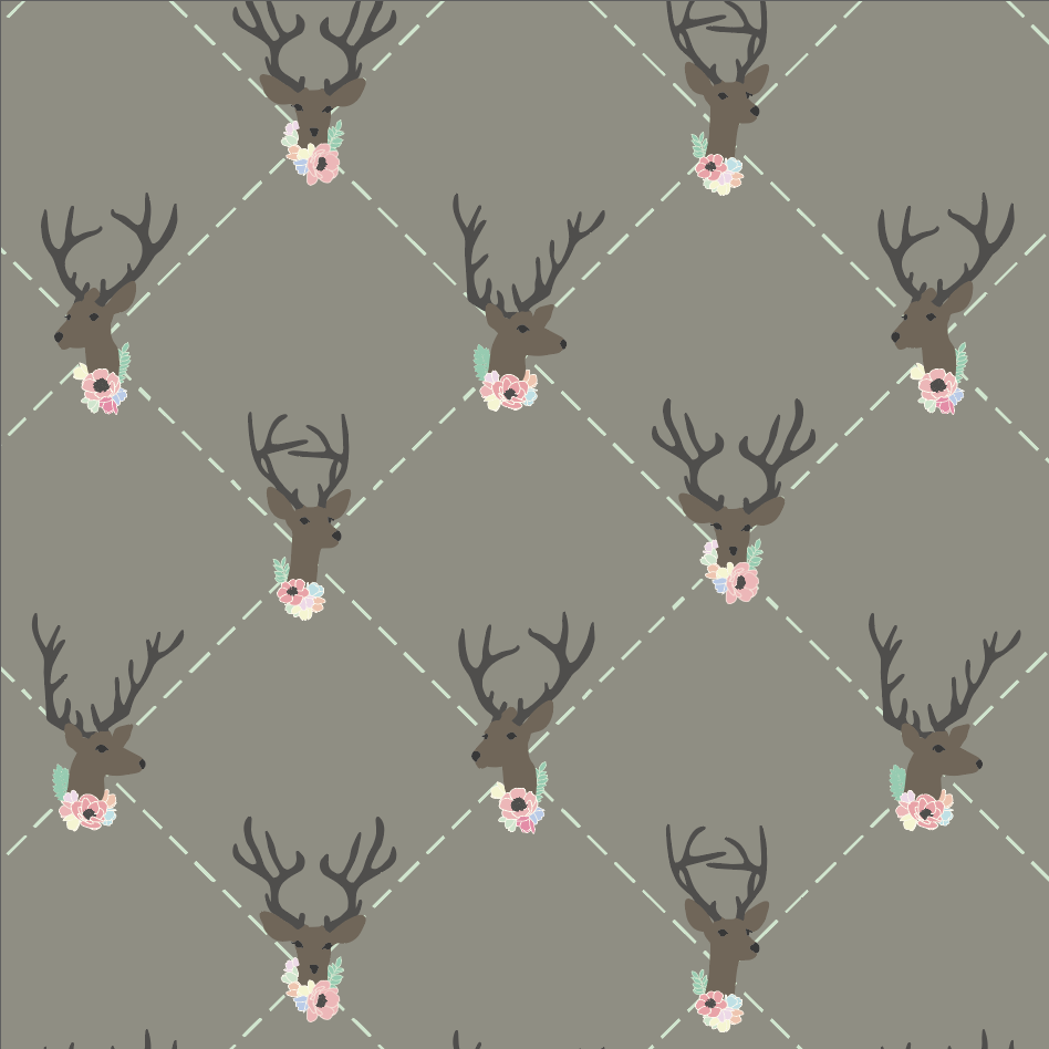
This is the second collection that I have designed. It was created around an outdoor/hunting theme and inspired by my youngest daughter. She is my tomboy, my outdoors girlie and so very independent. There is a strong, tough side to her, but at the same time she is so soft and sweet. All of the designs for this collection were made with her in mind.

Strong & Sweet Collection by rePapered
After designing this collection I realized that it would make a sweet theme for baby products. Can you imagine a onesie covered in flower camo? Or a swaddling blanket in the mountain landscape? Perhaps a diaper bag lining with the X and Os? And the mix of deer, arrows and flowers on a nursery wall would sure cozy up the room, don’t you think?
I would love your feedback on this collection.
Which prints are your fave?
Creative Habit 2: Turning Adversity into Advantage
These are unprecedented times. As we all adjust to social distancing and taking precautionary measures while out in public, everyone responds in a different way. There are those who welcome the time at home, to be closer to immediate family, to have a slower pace, and to prioritize their lives during this pandemic. There are those who are pushing back, eager to meet up with friends (because FOBA and FOMO rule*), eager to eat out in a restaurant and eager for life to ‘get back to normal’. And then there are all manner of those who fall in between and spill over the edges.
But did you know that some of the strongest personal growth, deep transformation and bold creativity come out of experiences where one suffers, struggles or feels defeat?
It is through overcoming such struggles that we discover just how strong and beautiful we are as individuals. As we each live through the day by day news reports, statistic updates, and social media messaging, we have a choice how to respond. It is in such moments of adversity when we turn inward and look to what we actually believe. Often we find that the old belief structures no longer hold true and we begin to create new meaning for ourselves.
Creativity is giving yourself permission to see things differently. - David Robert
When roadblocks are plopped in front of us, it is our human nature to find another pathway around them. How many of you have attempted to cut your own hair (or someone in your family), tried a new recipe or redecorated a room in your house during this pandemic? You are exercising your creativity.
It is during our darkest moments that we must focus to see the light. - Aristotle Onassis
Somehow we find a way through hard times. Often we get creative doing it. The brain is an amazing problem solving machine and when it sees a roadblock it sets about to smooth things over. When things are going as normal, the brain gets a bit bored and actually tunes out the typical. But when things get stirred up, the brain is awakened and revitalized by the novelty and challenge of the situation.
Do you feel it?
*FOBA - fear of being alone & FOMO - fear of missing out =)

Creative Habit 1: Driven by Passion
I am attracted to people who exude passion.
I have recently been watching the Masterclass by Marc Jacobs on Fashion Design. I have no desire (at this point) to become a fashion designer. But what I was so attracted to was Marc Jacobs’ passion for what he does. Listening to him speak about his career and what he has learned over the years, I was equally impressed and inspired by his passion for fashion design. All careers come with ups and downs and Mr Jacobs speaks to that, but at the end of the day it is one’s passion for the job that keeps you coming back and it was clearly evident in his class.
There are many connotations for passion. I like to think of it as an immense desire and love of what interests you, to the point of throwing your entire being into the pursuit of your passion. The famous blog Life Hack claims that passion is more important than money when it comes to your life’s work. And I agree.
Passionate people are driven by their intense interest in and desire to excel in whatever they are passionate about. You can spot people with passion because they are often quite chatty about their craft. When listening to Marc Jacobs I saw an exuberance for fashion design that I do not see in everyone. His face lights up, his tone of voice is light and cheery and he just can’t share enough about his love for design. I also had a strong sense that he just wants everyone to love fashion design as much as he does.
This kind of excitement is contagious. Passionate people are contagious. If you are fortunate enough to know someone or listen to an interview of someone with passion, you will know it.
And you may even be a little more inclined to find passion for yourself!
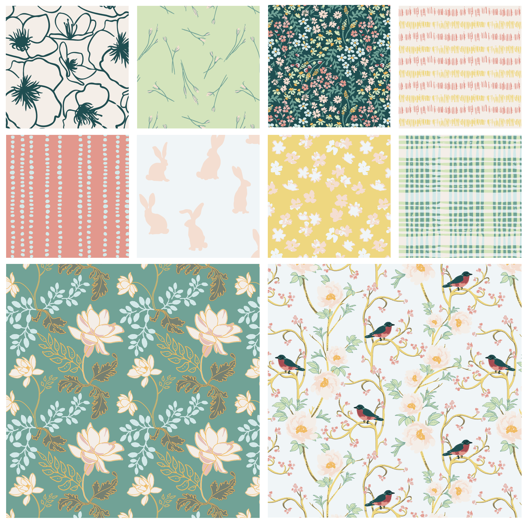
First Pattern Collection
So…I made my first pattern collection!
While taking the Immersion course with Bonnie Christine, I was creating the motifs for a collection. By the end of the course I was able to put all of my newly acquired skills together to complete an entire pattern collection. This is a big deal for me!
During the past year I have been creating my own patterns using my original watercolour motifs and then trying to put them together using my skills in Photoshop. But Photoshop does not hold a candle to Illustrator when it comes to creating a pattern. So it was high time to learn Adobe Illustrator and that is what I did.
I named my collection Leaping Forward as we were on the verge of spring as I took the Immersion course and it was a nod to my decision to leap into a new adventure.

A collection consists of two hero prints…

Bird in Paradise

Royal Lotus
Then there are a variety of blender prints and coordinates…

Dripping Down & Backyard Bunnies

Field Flowers & Scratchy Grass

Little Minis & Picnic in the Park

Sketchy Blooms & Budding Blooms
Looking back I have so much to learn, but looking forward…I am ready to leap!
Keeping A Sketchbook
Wow.
The start of 2020 has not been what I expected.
The world is in turmoil over the COVID-19 pandemic and life is not as we formerly knew it.
But life does go on - right?
We just have to establish a new normal. And we can do that by continuing with the things we love and letting go of the things we cannot control.
So that is what I have been doing during this time of social distancing and isolation. I have been doing what I love and that is learning and creating.
In early spring I signed up for a course from Bonnie Christine, who is a well-known surface pattern designer. Her course taught me, not only the tools of Adobe Illustrator, but the business of pattern design. And I am all in! I will have more to share over the coming weeks on this, but for now, I want to simply share what is making me happy…
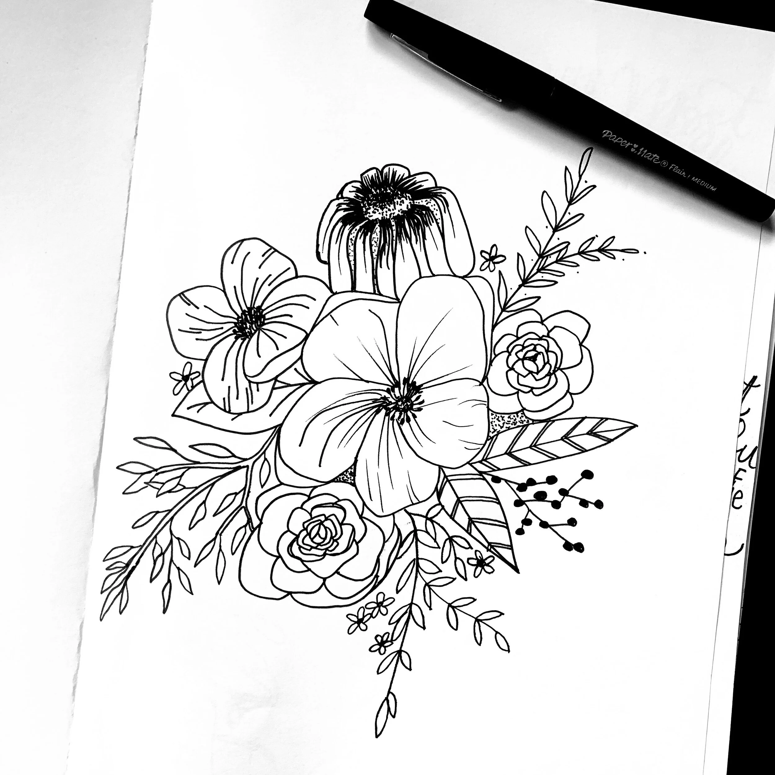
Inspired in the Immersion course, I am now keeping a daily sketchbook.

Sticker courtesy of the Immersion course by Bonnie Christine
It is not perfected drawings and I scribble things out a lot. But it is becoming a collection whatever comes to mind. Sometimes I see something inspiring on TV, or Pinterest, or IG, or in a magazine (like my new fave Uppercase) and it just needs to be captured.

Keeping a running sketchbook has not been a part of my creative practice in the past. But with the intent to make patterns, everything is now an idea to be captured as I do not know where it could possibly lead. This sketchbook is becoming my favourite thing to do while being holed up at home. And I am loving it.
Sometimes I simply write words or ideas that inspire me…

Words from Elisabeth Olwen
Sometimes I have ideas for a collection and sometimes it is just motifs that I want to explore and play with more. At any rate, the pages of this sketchbook are quickly filling and I cannot believe that I have never taken on this practice before!

How about you?
What are you inspired by in these crazy times?
What are you dedicating your time to that makes you happy?
Go Big or Go Small?
Creativity comes in many forms. From photography to watercolour painting and sculpture to stop motion films, the range is very wide. Even within art journaling, scrapbooking and those who keep planners, there are numerous preferences and outlets. And then there is the size of format that varies from one artist to the next. Some prefer to go big and some prefer to go small.
Did you know that the brain is stimulated by novelty? Something new or out of the ordinary or unexpected actually fires the neurons in our brain! If you have ever experienced ‘creativity block’ then you know how hard it is to come up with ideas or inspiration in those moments (or days. or months), but all the brain needs is a kickstart and that can be achieved by novelty or moving outside of your comfort zone. The writer who stares at a blank page could watch and listen to the birds to be flooded once again with language. The sculptor can try playing with paint, the collage artist can try stepping out to take a few photographs… in each case, the brain will suddenly awaken instead of tuning out the ritualistic motions of working in one’s preferred medium.

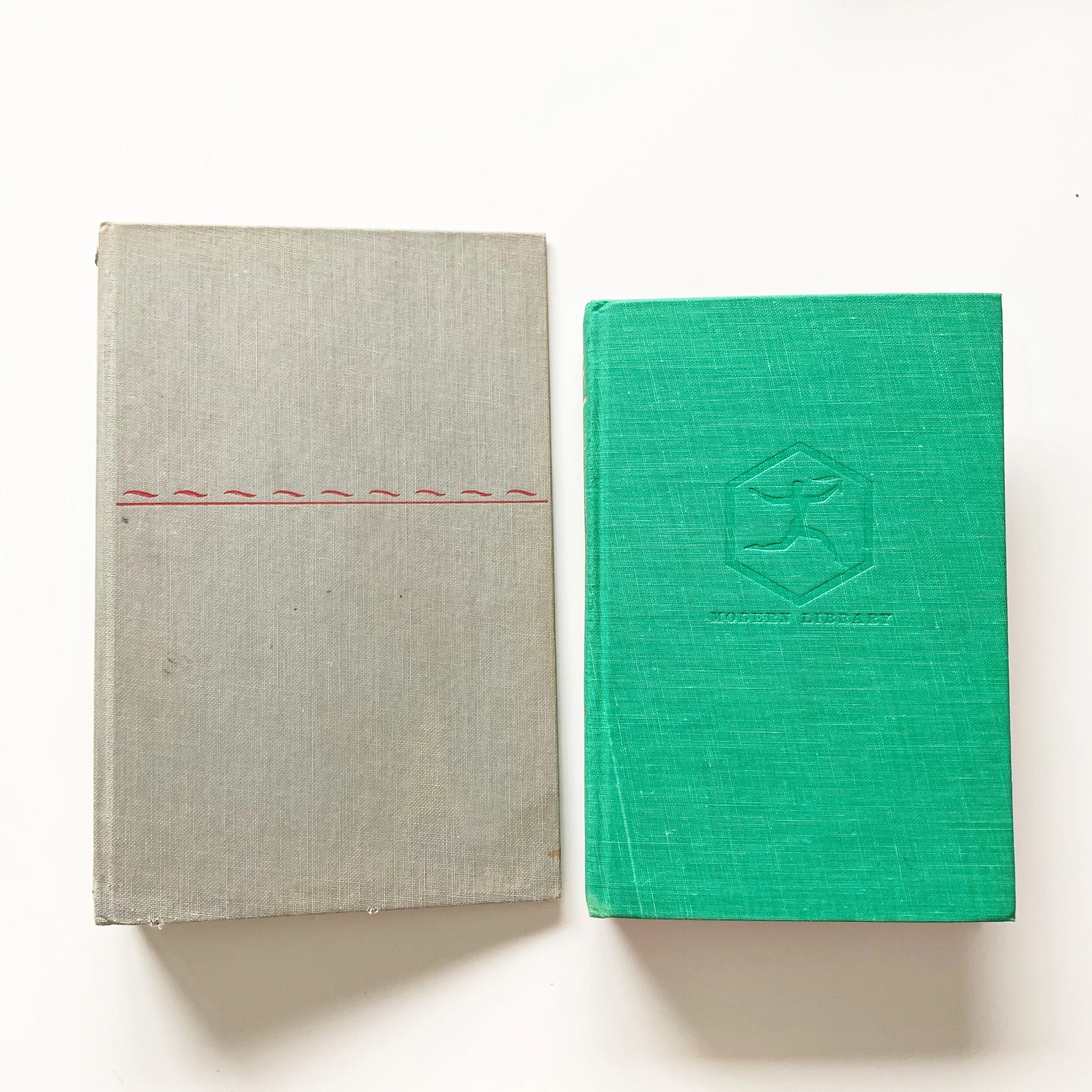
TN book covers from vintage books
Many scrapbookers, art journalists or planner addicts have a preferred size of book in which they consistently work. Right now, the trend for scrapbookers is the traditional Traveler’s Notebook size (8.25in x 4.25in) and many planners or bullet journalers are using an A5 or 8x6in or larger notebook. But it all depends on the artist.
Herein lays the challenge. As a scrapbooker, art journalist or planner addict, have you tried working in a different sized book? In doing so, you may uncover new inspiration, new talent and at the very least, a new challenge. Perhaps I can give you some insight…

Repurposed Book and insert from rePaperedShop
Reasons To Go Big
you are used to the Traveler’s Notebook size
you like to write a lot
you want to add extra lettering, photos, ephemera
you are documenting a longer time frame
Reasons To Go Small
you can still do scrapbooking or journaling or planning!
you like bullet points - keep it simple
you want to carry it in your purse
you want cuteness!
you are documenting a shorter time frame

Two sizes of book covers and inserts are available at rePaperedShop
Regardless of size, there remain similarities in both big and small sizes:
you need a system of productivity or documentation
you need a catch all for important stuff
you are a die hard for analog
you are a creative
So, will you take up my challenge and try a notebook in a new size in 2020?
You may discover a favourite new size!
3 Reasons Why You Need Pretty Pocket Folders
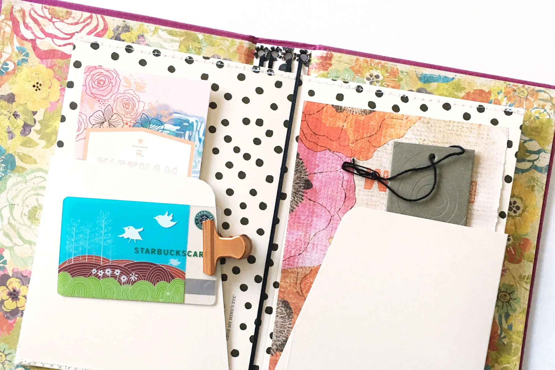
You know when you find that special item that just makes sense? It’s like…where has this been all my life? Or…finally someone came up with the perfect things that I have needed! Well, that’s what I felt when I first made these folders. They just make sense. There are so many little bits that life offers and that we have to pass up because there is nowhere for them to go. But often they are the little reminders that take us back to a special time and place. The ticket that reminds you of your first concert. The receipt from the ice cream store that you first went to with your boyfriend. The drink coaster from the cool pub that you recently discovered. All of these seemingly insignificant bits make up the pieces of your life and who you are. But without a purposeful place to put them, they often get lost or left behind altogether.
However, when I travel, I now find that I grab those maps and brochures because when I get home I am going to put them in my pretty little folder for safe keeping. Then one day, when my granddaughter is flipping through my journal and asks where this bookmark is from I can tell her it came from a bookstore in Italy on my 25th anniversary trip (and then continue to draw on that little tweak of my memory and tell her how we had climbed the 66 arches in Bologna and after making our way back down we dipped into this little bookshop on such-and-such street where I bought an Italian fairy tale book and they tucked in this bookmark as a freebie)!
If you find yourself nodding here, then I encourage you to read on to find out the 3 reasons why you need one of these pretty pocket folders…

You like pretty things
Not only are these pocket folders pretty, but they will help to keep all your items visible and arranged in an organized way - and that is pretty too! Now, when I am out and about, I look for all the pretty things because I know that I have a special place to keep them all. And I love looking back through these folders as reminders of what I have done in past days.

2. You will have all your important ephemera in one place
Last spring Hubby and I went on our Bucket List trip to Italy. Of course I created a personalized journal to document the entire experience. But it was these folders that took it from just a journal to a beautiful display tool! Every event that we attended, every shop that we entered, every restaurant that we ate at and every tourist station that we inquired at yielded maps, business cards, drink coasters, receipts, pamphlets and brochures. Well, I grabbed them all! Having a place to tuck all these reminders of the little things (and big things) on our trip made it all worthwhile. And now, when I share my travel journal with friends and family, all of the ephemera is in one place neatly organized and prettily displayed. And that’s what a girl wants, right?

3. Your friends will all be asking where you bought it
Not only will you be organized, but others will be looking over your shoulder when you whip out your little pocket folder to produce the movie tickets you have safely stored for this moment. Not only will they be impressed that your tickets are not crumpled, but they will feel a little pang that you have something so cute to store them in. And then they will want to know where you got this lovely folder. Of course you will tell them at rePaperedShop!

So, do not be hesitant to collect the things that tell your life story any longer. Even though Marie Kondo may say otherwise, collecting gives us a sense of belonging and history.
Your future generations will thank you…
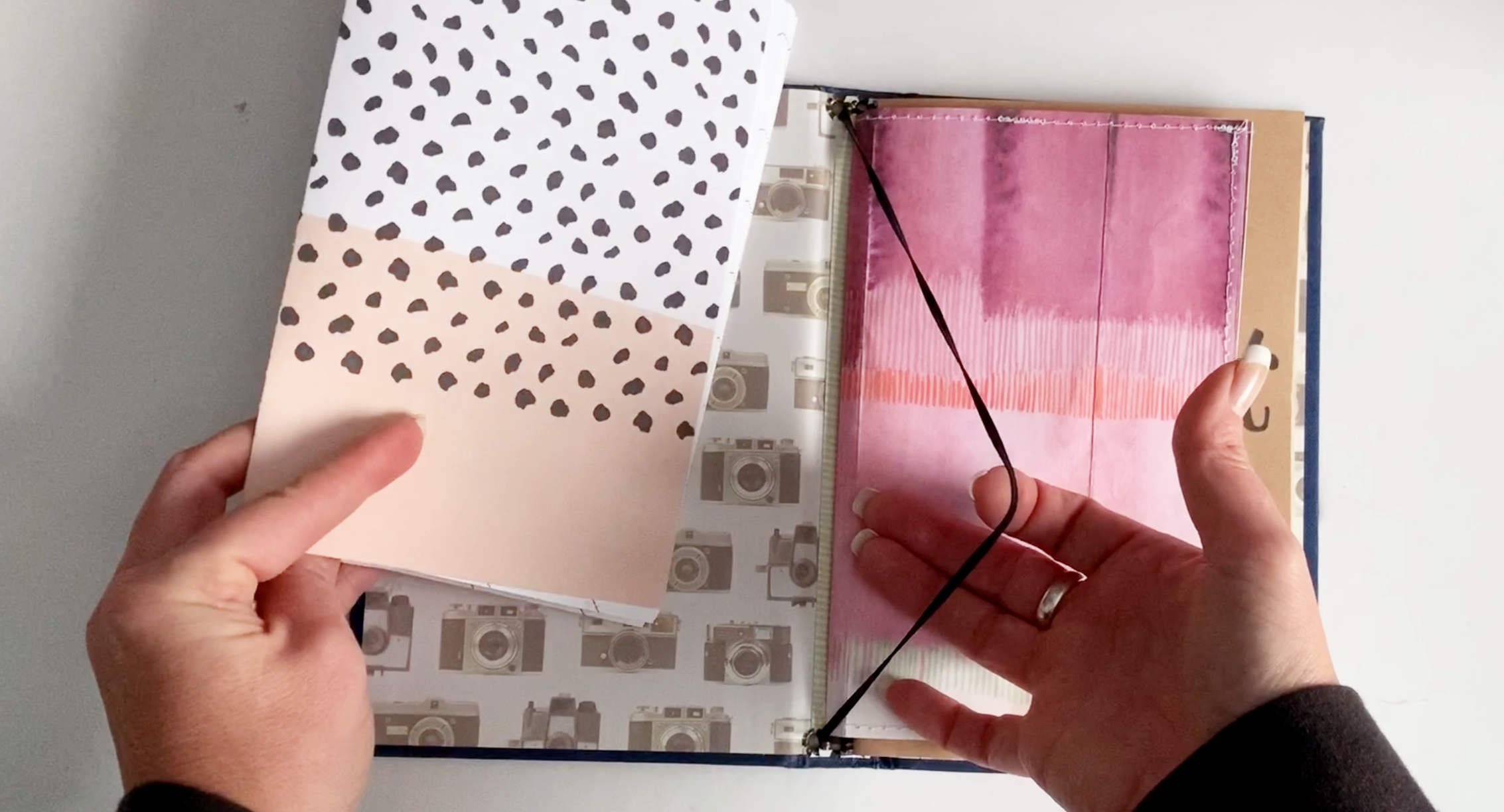
Traveler's Notebook Set Up 1
I love paper. And notebooks. And journals. And piles of it all.
So it comes as no surprise that I am always playing with different ways to configure my traveler’s notebook.
Here is a look at one way to customize your notebook…

About Me
Happy New Year! And yay to 2020!
As we begin a new year (and new decade) I thought it was time to share a bit about myself and this little blog.
I am a creator.
Currently I am still working full-time as an educator. Doing this blog and Etsy shop are my side gig but I look forward to working on them every night when I get home. I am intellectually stimulated during the day and in the evenings I create with my hands. It’s the perfect combo for me! My passions lay in the intersection of learn and create. Driven by the next new idea (and how I can accomplish it) is what propels me forward. I love to do calligraphy and watercolour painting and am trying to incorporate them into my little business as well.
I am a wife and mother.
Being married 26 years is one of my greatest accomplishments. Perhaps it is our mantra of being a ‘team’ that has made us strong, but the longevity of our relationship has deepened it and I am grateful. We have two lovely girls who are pursuing their careers and dreams and we couldn’t be more proud.
I am a small-business owner.
Since starting my Etsy shop named rePaperedShop in 2017, I have learned so much. My launch has been slow but steady as time allows. I think I am disobeying all the ‘rules’ of starting a business and blog, which tell you to be consistent and ever-present and curate a mailing list and follow a social media calendar. Hasn’t happened for me…yet. But I am making my way the best way I know how right now. Slowly I am making some videos on You Tube and I am growing a small audience on Instagram so I feel like progress is being made.
I am looking toward the future.
My goals for 2020 are to grow many areas of my business (obviously) but to keep it all manageable. It will happen, but it doesn’t all have to happen by tomorrow.
Thank you to all of you who have shown an interest in my endeavours and I wish you all the best for 2020!