Do you love rooms that just seem cohesive and settled even though they are full of patterns?
Here are 5 strong, practical rules for mixing patterns in a room so that it feels layered and intentional rather than chaotic or overly matched.
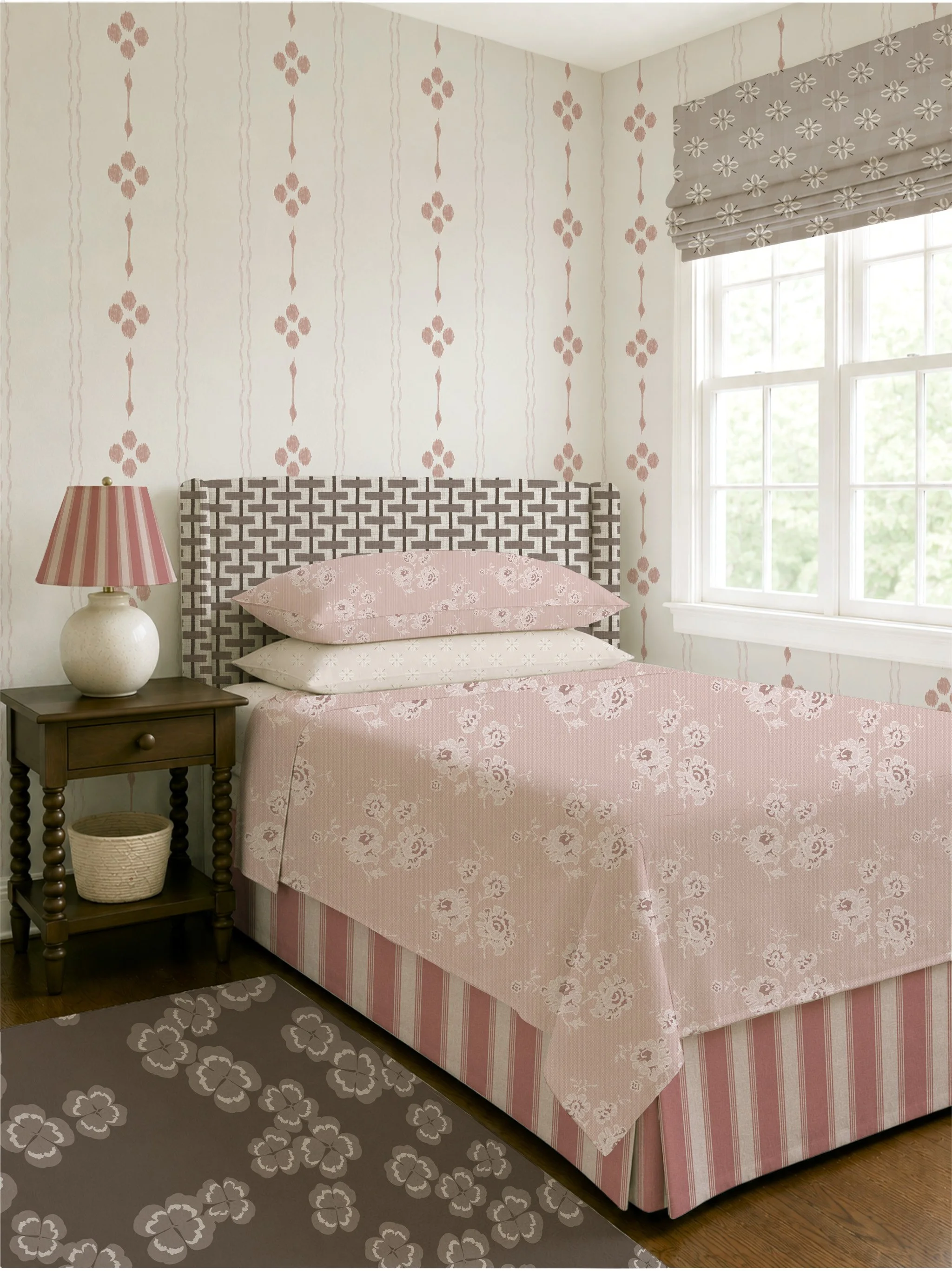
1. Start with a Hero Pattern
Choose one dominant print to lead the room.
This is typically:
Wallpaper
Drapery
Bedding
Large upholstery piece (headboard, sofa, accent chair)
The hero pattern should establish the mood, scale, and colour direction of the space.
For example:
Large floral chintz → romantic English cottage
Structured stripe → tailored heritage
Organic botanical → relaxed European estate
Everything else should support—not compete with—the hero.
2. Vary the Scale (Large / Medium / Small)
One of the biggest mistakes is using patterns that are all the same visual weight.
A reliable formula:
60% Large Scale → statement pattern
30% Medium Scale → supporting print
10% Small Scale or Texture → subtle grounding
Think in contrast:
Large
Oversized florals
Scenic prints
Bold botanicals
Medium
Vine motifs
Damasks
Lattice or trellis
Small
Tiny ditsy florals
Pinstripes
Dots
Small geometrics
Example:
Large cabbage roses + medium ticking stripe + tiny scattered bud print = cohesive, layered, collected.
3. Mix Pattern Types, Not Just Different Prints
Rooms feel richer when pattern families contrast.
Try combining:
Organic: florals, botanicals, vines
Structured: stripes, plaids, checks
Textural/Quiet: woven look, subtle geometric, tone-on-tone
A useful formula:
1 floral + 1 stripe/check + 1 subtle texture
Example for English cottage:
Romantic floral wallpaper
Mattress ticking stripe bedding
Small woven diamond on a bench cushion
This prevents the room from feeling “too floral” or visually flat.
4. Repeat Colours (But Not Perfectly)
Patterns do not need identical colours—but they should speak to one another.
Aim for:
2–4 repeated colours across the room
Different saturation or proportions
Example:
If the wallpaper has dusty rose, sage, cream, and ochre:
Bedding may emphasize cream + sage
Chair fabric picks up dusty rose
Lampshade introduces muted ochre
This feels collected rather than “bought as a set.”
A useful rule:
Shared palette, different emphasis.
5. Give the Eye Places to Rest
Pattern mixing works best when balanced with solids and texture.
Use:
Painted walls or trim
Linen bedding
Natural wood
Rattan
Velvet
Wool
Simple lampshades
Negative space is what makes layered rooms feel sophisticated instead of busy.
A Simple Formula You Can Almost Always Trust
For a cohesive room:
1 hero floral
1 stripe or check
1 supporting organic print
1 subtle blender/texture
This is one reason many classic interiors feel so effortless—they are intentionally varied, not perfectly matched. The room feels collected over time rather than coordinated in a showroom sense.